When a handmade product like baklava is sold online, it's detail, not photography, that builds trust. Before ordering, customers want to see the weight, the price, how to store it, how it's delivered and the shop behind the product. If the page answers these questions, the master craftsman shows up on screen too.
A photo whets the appetite; it doesn't place the order
When a dessert shop goes online, the first instinct is the photo shoot: the glossiest tray, the tightest close-up, the best light. But a good photo makes a product desirable; it doesn't make people sure about it. The customer on the other side of the screen can't touch the tray, can't talk to the master, doesn't walk past the shop. That gap isn't closed by a bigger image but by clearer information.
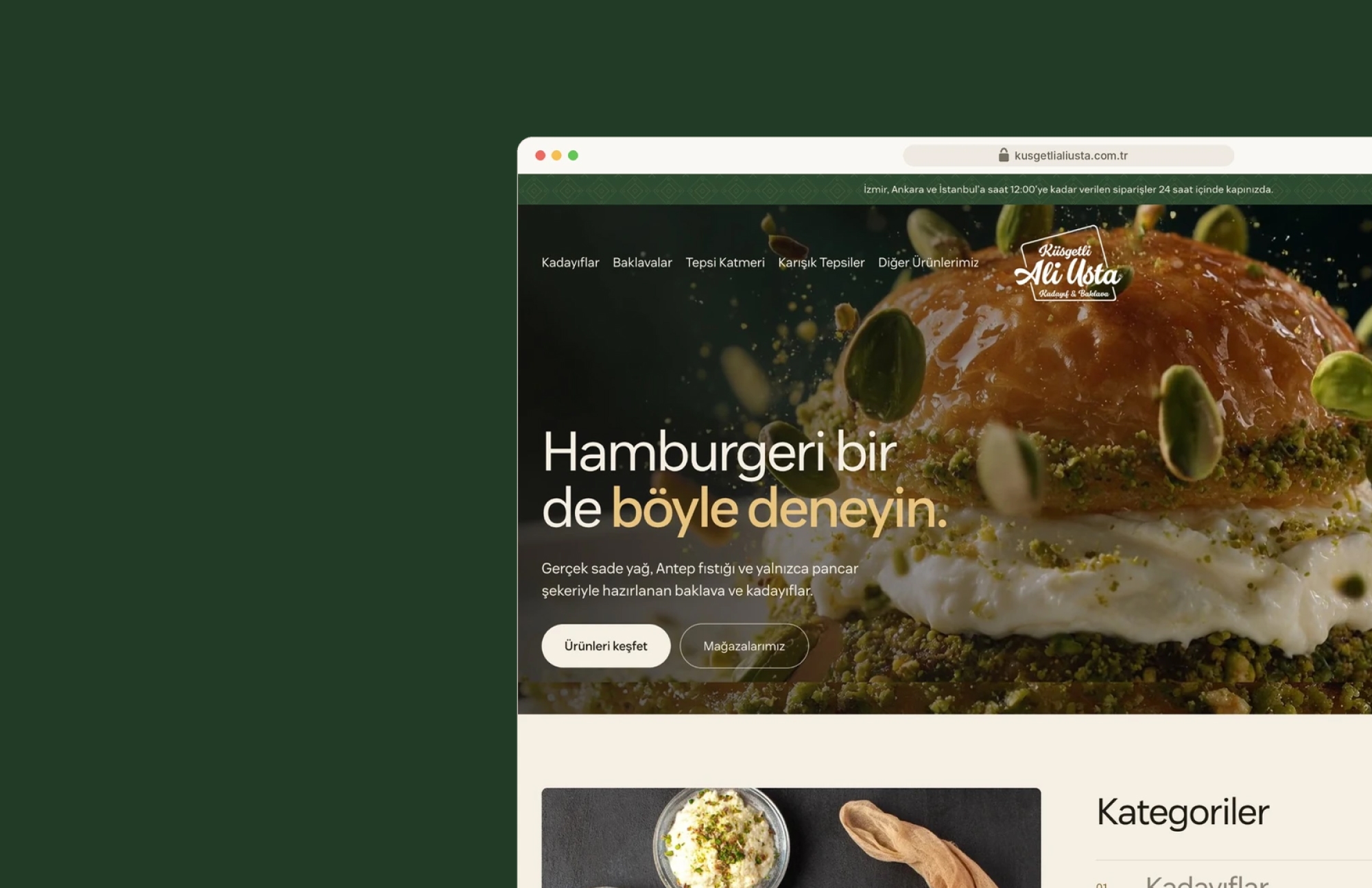
That was our starting point with Küsgetli Ali Usta. The product was real, and so was the master; but there was no digital surface that let people feel it. Tray products, weight options and delivery information by city weren't clear before ordering. What was missing wasn't images; it was answers.
In a shop, trust builds on its own. Customers see the tray on the counter, ask about the weight, watch the master's hands, look at how the package is prepared. Each of these moments carries information, but nobody thinks of it as information. Online, none of these moments happen on their own; each one needs a counterpart spelled out on the page.
A photo makes a product desirable; detail makes people sure of it.
How do you build trust when selling baklava online?
By making the page itself answer every question customers would ask before ordering. Selling on detail means answering the questions going through a customer's mind — how many grams, how much, how to store it, how it arrives, who makes it — on the page, without their having to ask anyone.
None of these questions is a big one. But each one left unanswered creates a small hesitation, and when the hesitations add up, the tab gets closed. With food, they add up faster, because customers think not only about whether they'll like the product but also about what condition it will be in when it reaches their door. The doubt that the person behind the counter clears up in a single sentence has to be cleared up by the detail itself on the website.
There's a trap here: more detail shouldn't mean a longer page. A product page that stacks every piece of information is just as tiring as a page with no information. The real work is placing each detail at the moment the customer will look for it.
On sites that sell handmade products, the places where detail most often gets lost are predictable. The weight is listed only on the product page, not in the listing, so customers have to open every product one by one. Delivery terms sit behind a link at the very bottom of the page. Questions are stacked on one long page that can't be searched. Store information appears only on the contact page. None of these mistakes make the design ugly, but each one tells customers they'll have to work a little harder to find the answer they want.
Where we placed the detail
We put the product ahead of the story, but we didn't lose the story. We worked on the flow in three places: the listing, the product page and the shop itself.
In the listing. On category pages, weight labels and prices appear on every card, so customers know which option fits their needs without clicking into the product. Sorting and grid options make the listing easy to scan. The flow stays short: choose a weight, add to cart, continue.
On the product page. Ingredients, storage and delivery information sit under collapsible headings. The page doesn't get longer, but the information is one tap away. A customer wondering how to store the product doesn't go looking for a separate page; the answer is right below the add-to-cart button.
In the shop. The master's story is part of the detail too. The About section tells his journey in a short paragraph. For each of the three stores, the address, phone number, opening hours and directions are gathered on a single card. A store's full street address is the simplest proof that there's a real business behind the website.
Finally, the longest list customers have before ordering: their questions. The order line, opening hours and 35 questions were gathered into a searchable help center organized by category. Customers can find their answer without picking up the phone, and if they do want to call, the number is right there.
No part of this layout draws attention on its own, and it shouldn't. Detail works when it operates in the background, not on stage. A visitor leaving the site probably won't remember the weight label or the collapsible heading. What they'll remember is that they never had to ask the question that came to mind. That's exactly the job of well-placed detail: to remove doubt without being noticed.
Rules we follow when selling on detail
Three rules we believe hold for any site that sells handmade products:
- Price and weight go on the card. Customers shouldn't have to click into a product to see the options; the difference between tray sizes and weights should be readable in the listing.
- Information isn't hidden; it's folded away. Details such as ingredients, storage and delivery can go under collapsible headings to keep the page short, but they're never exiled to a separate page.
- The shop stays visible. The address, phone number and opening hours sit within the flow, not in a corner of the site; customers want to know who they're buying from.
Detail isn't written once and forgotten
Selling on detail comes at a cost: the detail has to stay accurate. Opening hours change, a new product is added, delivery terms are updated, customers start asking a question nobody has asked before. A photo can stay the same for years; information can't.
That's why we treat detail as part of the content, not the design. Organizing questions into categories and making them searchable makes life easier not only for customers but also for the business: when a new question comes in, it's clear where it goes. Likewise, gathering store information on a single card means only one place needs updating when something changes. Wrong opening hours lose more trust than hours that were never listed.
The visual language exists to carry the detail
A warm cream background, Antep pistachio green and gold accents bring the feel of the master's shop to every page, and the contact and FAQ pages speak the same language. The vision and mission text sits in a single readable column, and the principles in four short cards. But the job of this visual language isn't decoration; it's making the detail readable. Color and typography are valuable to the extent that they keep the weight label and the storage information from being overlooked.
When everything on the tray is clearly spelled out, the photo can do the job it's meant for: whet the appetite. Detail takes care of the rest. The craftsmanship is already in the product; the site's job is to get it to the customer on the other side of the screen without a shadow of doubt.
Our advice to any business getting ready to sell a handmade product online is the same: write your list of questions before your shot list. Collect the questions customers ask most often in the shop and mark where each one will be answered on the site. Make the photos good enough to dress up the answers on that list, but don't let them try to replace it.