For Bak.Pay, we didn't start the identity work with a color palette. We started with the two seconds a user hesitates on the payment screen. In this piece, we walk through how each brand decision translates directly into the interface.
Trust is not a color
Most finance brands try to solve trust with blue. But users read trust in consistency, not color: the same button sitting in the same place on every screen, the same language throughout, a tone that doesn't blame the user when something goes wrong. That's why we started the identity work not with a moodboard but with an inventory of the 40 screens in the existing product.
The inventory made things clear: the brand was using six different greens, four different button heights and two separate tones of voice. What users saw wasn't a brand; it was a collection of screens that merely resembled each other.
Users read trust in consistency, not color.
The two-second hesitation
One moment kept recurring in user testing: right before tapping to confirm a payment, a pause of about two seconds on average. People re-read the amount, checked the recipient's name and only then tapped. We decided not to eliminate this pause, but to make room for it.
Instead of simplifying the confirmation screen, we changed its hierarchy: the amount became the largest element, the recipient's details moved directly beneath it, and everything else dropped to a secondary layer. The place where the brand's typography is used most forcefully is now this screen, not the marketing page.
Three decisions that moved from identity to interface
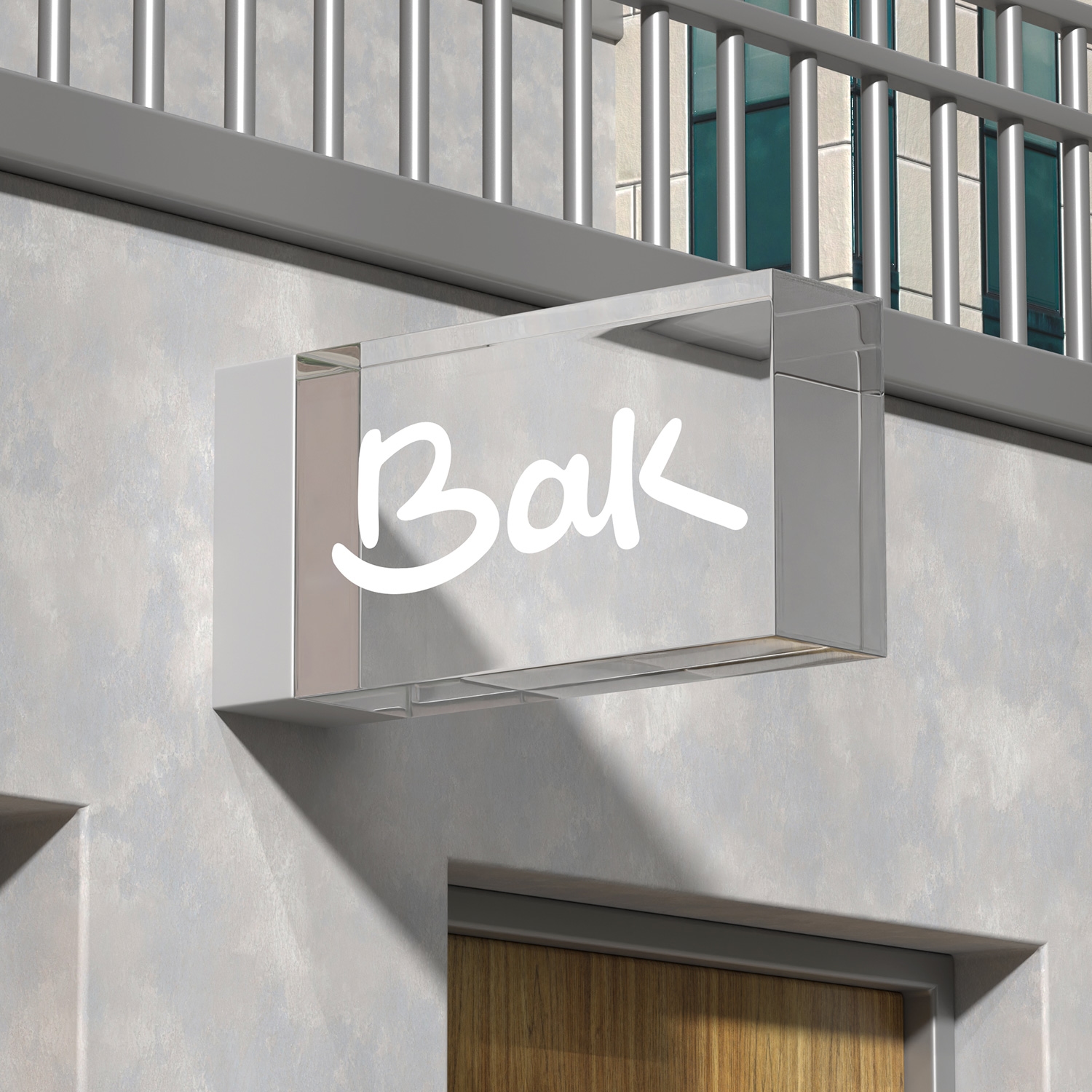
- One symbol, one scale. The symbol was optically redrawn to read with the same weight at 16px and at 160px; a single file is used everywhere, from the app icon to the card design.
- Neutral ground, single accent. The palette was reduced to two neutrals and a single accent color. The accent is used only on elements that call for action, so the most colorful thing on the screen is always the thing the user needs to do.
- Error copy that doesn't blame. Instead of "Invalid card," we built a language like "We couldn't verify this card number," one that puts the responsibility on the system. The same tone carried all the way through to the contract copy.
What we measured
These numbers aren't the result of a campaign; they're the sum of small, repeated decisions. The output of the identity work wasn't a guidelines file but a set of decisions the teams turn to in every sprint.
What we learned
Treat brand work as a layer outside the product, and it melts away in the first busy sprint. Build it backward from the product's most critical screen, and the identity defends itself. At Bak.Pay, the logo was the last thing we drew, and that order was deliberate.