In clinic management software, speed is determined not by how quickly the doctor examines a patient, but by how quickly the receptionist completes an appointment, a patient record and a payment. When you design for the person who uses the dashboard most, the software gets faster for the whole team.
The first reflex: putting the doctor at the center
When designing clinic software, the first reflex is to put the doctor at the center. The examination screen, the treatment history, the doctor's notes. It's an understandable reflex; the person who chooses the software, and whose name is on the clinic, is usually the doctor. But it's the front desk, not the doctor, that carries the clinic's flow through the day.
A patient calls, and an appointment is booked. The patient arrives, and their record is opened or found. The examination ends, payment is taken, the next appointment is scheduled. In this chain, the link that passes across the doctor's desk is small; most of the rest happens on the receptionist's screen. If the dashboard is slow on that screen, the patient reaches the doctor late too.
And the front desk's work isn't a single flow. While the phone is ringing, a new patient walks in, and at the same moment another patient is waiting to pay. The receptionist moves back and forth between these tasks all day. The doctor can focus on one patient; the receptionist is in the middle of several things at once. These moments of divided attention are exactly where a dashboard is really put to the test.
The problem we solved at Birhekim
When we started on Birhekim, clinics were handling appointments, patient tracking, billing and staff tasks with disconnected tools. Desktop programs that required installation were slowing teams down. The person who pays the highest price for this kind of fragmentation is the one who has to touch every one of these tools in the same day.
Our goal was to bring the work of six separate pieces of software together on a single cloud platform: a clinic management experience that needs no installation, where the doctor, the receptionist and the patient meet in the same system. That goal raised a design question of its own. When the work of six tools goes into one dashboard, which one comes first?
Before answering, we made clear who we were designing for. Three distinct users met in the same system: the doctor, the receptionist and the patient. All three had real needs, but the screen where the dashboard stayed open all day was the receptionist's. Building the hierarchy around that fact didn't mean neglecting the other two users; it meant strengthening the source of the information that reaches them.
Clinic management software is software that brings a clinic's appointments, patient records, billing, staff and reporting together in a single system. The definition is simple. The hard part is deciding, once all of this goes into the same dashboard, what sits one tap away and what sits one menu away.
When that decision isn't made, the result is familiar: the six tools' menus get stacked one under another, each module gets its own tab, and the dashboard turns into the sum of the old tools. Users are no longer opening six programs separately, but they're still working with six different logics. One dashboard doesn't mean one flow; that has to be built through design decisions.
Which screen should come first in clinic management software?
The screen that should come first is the one that's opened most often and carries the most repeated work. In most clinics, that's the day's appointment list, along with the steps for booking a new appointment and creating a new patient record.
When every module in a dashboard carries equal weight, they're all equally far away. The reporting center is opened every so often; the appointment screen, many times a day. Giving them the same weight in the menu slows frequent tasks down to the pace of infrequent ones. That's why we build the hierarchy of a clinic dashboard around how often things are used, not how important the modules are.
Besides frequency, there's context. When the receptionist books an appointment, they often look up the patient too, and open a new record if needed. Having these three tasks in three separate modules, on three separate screens, keeps the patient on the phone waiting as well. Tasks that follow one another should sit close to one another in the dashboard.
The same goes for billing. Payment after the examination is the last step of the appointment; it should be treated as the appointment's close, not as a separate accounting task.
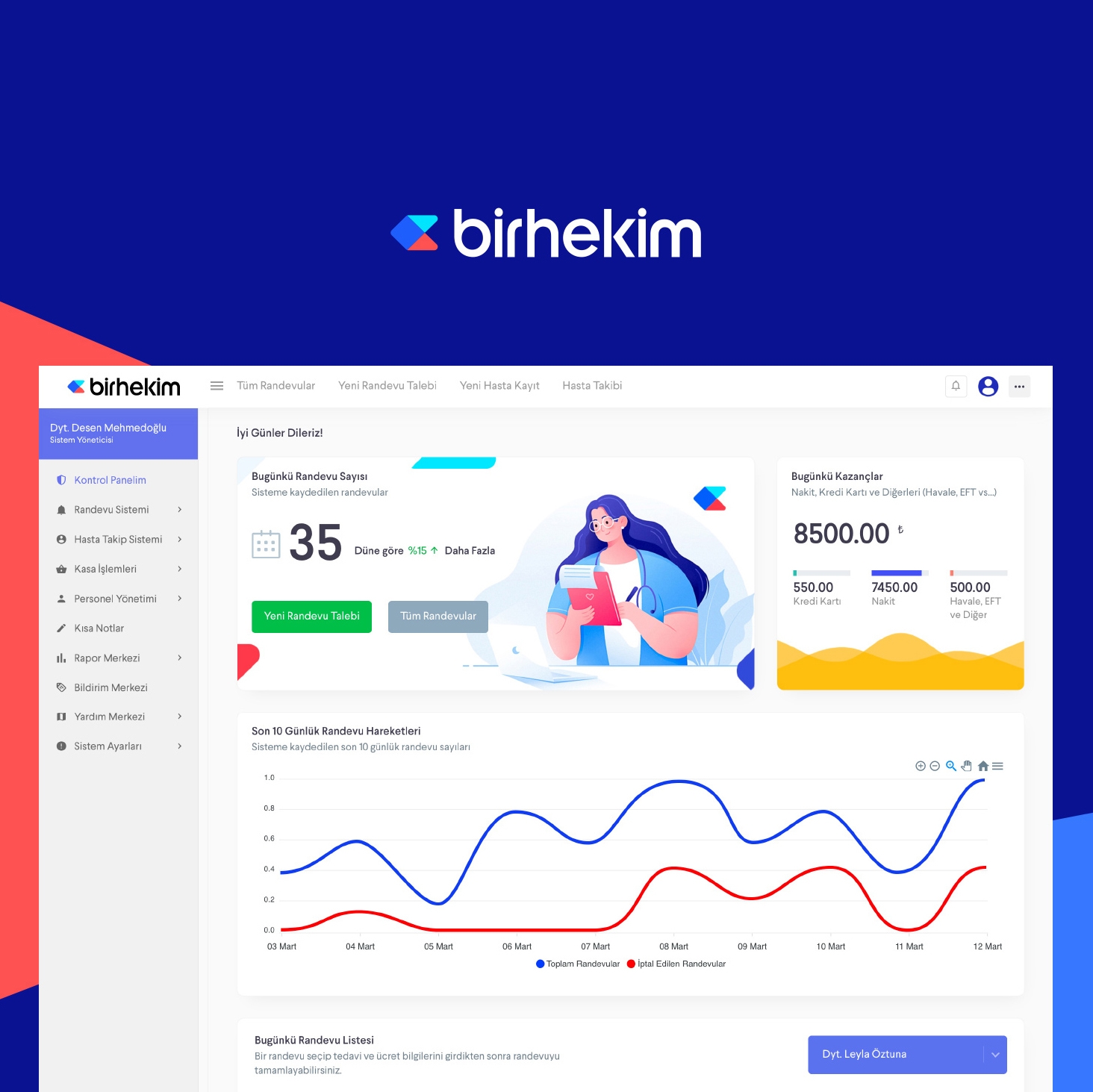
At Birhekim, we built the appointment system, patient tracking, billing, staff management and the reporting center on a shared component set. More than a hundred screens work to the same rhythm. That means the receptionist doesn't have to relearn the interface when moving from one module to another. We treated the path from appointment to billing not as a chain of separate screens but as the flow of a single clinic day.
A dashboard's speed is measured by how many steps it takes its busiest user to reach the task they do most often.
Three rules we follow when designing for the front desk
The rules we follow when building clinic dashboards around their busiest user:
- Frequency sets the hierarchy. The order of the menu is based not on how important the modules are but on how often they're opened during the day. Work done every day sits one tap away; work done rarely sits one menu away.
- The same task looks the same everywhere. Search, lists, forms and confirmations work with the same components in every module. A shared component set isn't just a design preference; it's the speed of the front desk.
- No installation, no waiting. The dashboard opens without any installation. The burden of installing and updating desktop software falls hardest on whoever sits at that computer; a cloud platform takes that burden off them.
These rules don't push the doctor into the background. On the contrary, every piece of information that reaches the doctor's screen is accurate because it was entered correctly and on time at the front desk. The doctor's speed is a result of the receptionist's.
The same approach applies on the patient side. Online booking isn't a way to hand the front desk's workload over to the patient; it's a way to bring the front desk orderly, complete information. An appointment the patient books themselves should look the same in the receptionist's dashboard as one the receptionist entered.
A product effort spanning a year
Birhekim wasn't a one-off interface job; it was a product design process spanning 52 weeks. Alongside the dashboard, we also built the website that presents the product: a visual language that combines a colorful mosaic system with portraits of real people, and a structure in which every feature is explained on its own page with screenshots. Social media communication was built in the same geometric language.
Speed is a design decision
In clinic software, speed is a design decision before it's a performance metric. When you build the dashboard starting from the receptionist's day rather than the doctor's examination, the doctor gets faster too, because the patient arrives on time, with their record open and their bill ready.
At Birhekim, the brand identity, the product interface and communication design came together in a single system. That was what we were aiming for: a platform where the doctor, the receptionist and the patient speak the same language.