In a booking app, the screen that matters isn't the calendar; it's the screen where an existing appointment gets changed or canceled. A salon is chosen once, but an appointment gets postponed, moved and sometimes canceled. A business doesn't lose money when new appointments are booked; it loses money when these changes are made late or without a word.
The first instinct: make the calendar look good
When a salon booking app is being designed, the first instinct is to put the calendar front and center. Colored blocks, a weekly view, a day divided hour by hour. But the calendar is the screen you look at when things are going well. When things go wrong — when a client says they can't make it, or never says so at all — a different screen decides the outcome.
Part of the reason the calendar gets so much attention is presentation. The first image shown when a booking app is introduced is almost always a fully booked week. But what makes a salon owner's day hard isn't a full week; it's the gaps that open up unexpectedly within it. When you build the design around the showcase image, the screens that do the real work get pushed to later.
When we started on 3 Numara, salon owners kept appointments in a paper notebook, reminders on their phones and payments in a separate spreadsheet. The day's work was spread across disconnected tools; open slots and double bookings went unseen. In a notebook, a canceled appointment is just a crossed-out line. It doesn't tell anyone that the hour could be filled again.
So we looked for the problem not in how the calendar looks, but in what an appointment goes through after it's booked. The calendar shows a full day, but how that day actually goes depends on how quickly the changes within it become visible.
A salon's week never ends the way it was first planned. A client leaves work late, a staff member gets sick, a service runs longer than expected. These changes aren't exceptions; they're how the work normally goes. The product should treat them not as exceptions but as an ordinary part of the day.
How do you design the cancellation flow in a booking app?
A cancellation flow isn't designed to make backing out harder for clients; it's designed to make it easier for them to say so early. A good cancellation flow does two things at once: it gives the client a way out in a few taps, and it immediately shows the business the slot that has opened up.
The change flow is everything an appointment goes through after it's booked: postponing, moving the time, changing the service or the staff member, and canceling. Most booking apps design only the first step, booking the appointment. The rest is left to phone calls and messages.
When clients find that canceling is hard, they don't stop canceling; they stop letting you know. Instead of calling to explain, they simply don't show up. That's why shortening the path to a change works for the business, not against it. A cancellation that comes early is an hour that can be filled again. A cancellation that comes late, or never comes, is just an empty chair.
This has a counterpart on the salon side too. Changes usually come by phone: a client calls and wants to move their appointment. The staff member may be busy with another client at that moment. What's needed then isn't a detailed calendar but a short path that finds and changes the appointment in a few seconds. The longer a change takes, the more likely it is to be jotted down for later and forgotten.
How we handled the appointment's second life at 3 Numara
At 3 Numara, we designed the two sides of the salon separately: the app the business uses and the app clients book through. On both sides, we treated an appointment not as a one-time record but as an object that can change.
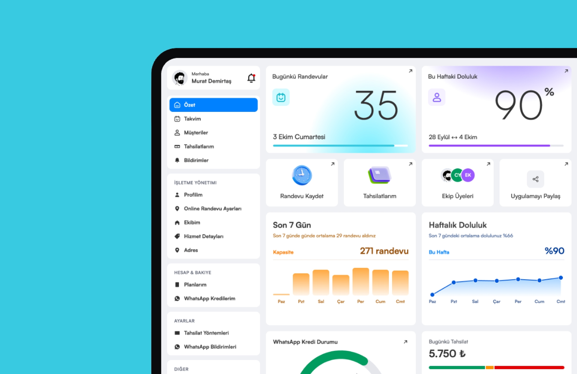
On the business side, the overview screen highlights the day's appointment count, weekly occupancy and quick actions. In the appointment list, open and booked slots can be told apart at a glance, and a new appointment is saved in a few taps. Noticing that an hour has opened up shouldn't require scanning the calendar line by line. The gap should make itself visible in the list.
On the client side, we handled time selection with a list that separates booked and open slots at a glance. Clients see the appointments they've booked on a separate My Appointments screen. Having a fixed place clients can come back to after booking is the first requirement of a change flow.
We moved reminders from phone calls to WhatsApp notifications. Each notification type can be turned on or off with a single tap, and the remaining credit is shown separately in plain language. The reminder is the front door of the cancellation flow: if clients remember their appointment in time, they can also tell you in time when they can't make it.
On tablets and computers, the menu, the content and the day's appointment list sit side by side in three columns. Client details, past appointments and payments open on the same surface without changing pages. Jumping from screen to screen while dealing with a caller's appointment is the first thing that slows a change down.
The calendar shows the full day; the cancel screen decides how much of that day you can save.
Three rules for the change flow
The rules we follow when designing the change flow in booking apps:
- A freed-up slot must be visible. When an appointment is canceled or moved, that hour should show up as open in the list right away. The business shouldn't be expected to notice on its own.
- Changing should be as easy as booking. If an appointment can be booked in a few taps, it should be possible to reschedule it in a few taps. Make canceling hard, and it comes back to you as a no-show.
- A reminder should leave time to decide. The point of a reminder isn't only to get the client in the door but to find out early if they can't come. So it should go out early enough for the client to change their plans.
None of these rules are meant to encourage cancellations. The goal is to accept that cancellations will happen anyway and move them to the moment that hurts the business least, which means as early as possible.
The same appointment, the same status, on every device
For the change flow to be reliable, it has to behave the same way on every device. When one person in the salon checks on a phone and another on a tablet, they should see the same appointment in the same state. If an appointment canceled on one device still shows as booked on another, the freed-up hour may as well never have opened.
At 3 Numara, we built a design language that keeps the same layout on phone, tablet and computer. We brought the product to iOS and Android from a single codebase with React Native and TypeScript. We ran the entire process ourselves, from brand identity to the website and from design to launch, so every decision about how an appointment behaves was made in one place.
Design the change, not the calendar
The value of a booking app shows not in a full calendar but in how quickly freed-up slots become visible. The calendar is the business's storefront; the change and cancellation screen is its kitchen. The storefront gets designed with care; the kitchen is usually left for later.
At 3 Numara, daily tasks like payments, staff schedules and service prices now sit in the same layout as appointments. If you're designing a salon booking app, don't start with the calendar; start with everything an appointment can go through after it's booked.