Shortening onboarding isn't enough. You need to bring forward the moment users first see value. The two sentences sound alike, but in design they lead to opposite decisions.
Cutting steps is the wrong goal
Onboarding optimization usually starts with deleting screens. But a three-screen flow that ends without giving the user anything is worse than a seven-screen flow. What we should measure isn't the number of steps but the time it takes to reach the first moment of value.
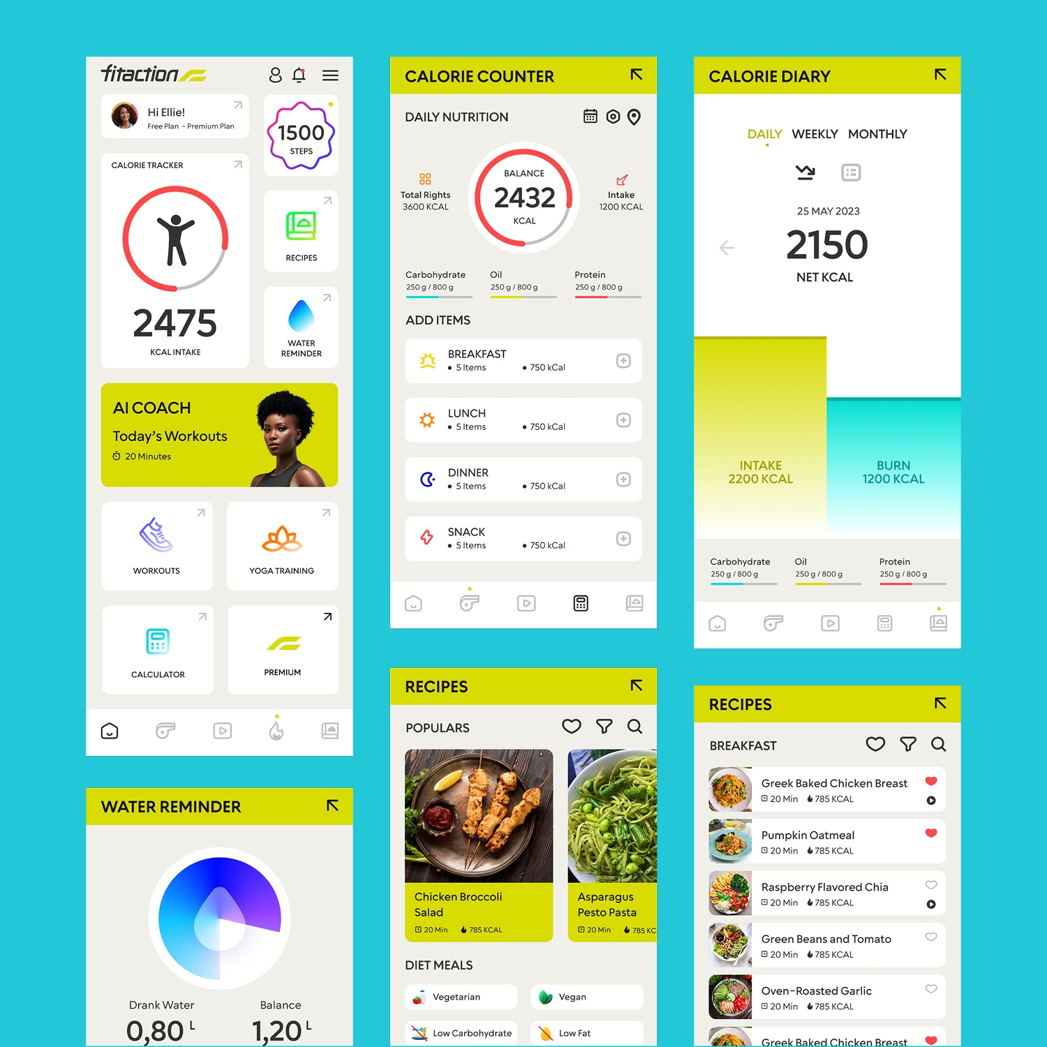
When we started measuring that time at Fitaction, the average came out to 4 minutes 20 seconds. Before seeing their first workout suggestion, users were answering questions about their profile, goals, level and equipment.
Users don't count steps; they count how long it takes before you're useful to them.
Put value first and questions later
We turned the flow around: the app now starts by showing a workout suggestion based on a quick three-question estimate, and the detailed profile questions come after the first workout, in context.
The result was the opposite of what intuition suggests: the profile completion rate didn't drop, it rose. Users could now see what the questions were for.
Three rules we applied
The rules we used to design the first 60 seconds:
- Postpone account creation. We don't ask users to sign up before they've seen value; sign-up appears once there's progress worth saving.
- No empty screens. No screen sits blank while waiting for data; each one arrives filled with sample content, which is replaced by the user's own data as it comes in.
- Every question is asked in context. The equipment question comes during the first workout, and the level question after the first one is completed.
What we measured
Results from the first eight weeks of the new flow:
What we learned
Every piece of data you ask for in the first session is a debt; if you don't give something back right away, you repay it with interest. Value first, forms later.