A product family doesn't get lost under one brand when the elements that stay fixed are separated from the elements that change right from the start. For Yöre's dairy range, we fixed the handwritten logotype and the green hill silhouette, and built the layer that describes the product and the line separately on each package. In product family packaging design, the balance between standing out on the shelf and reading as the same brand comes from this separation.
Giving every product its own face isn't the answer
The first reflex is to make every product its own star on the shelf. One color for kashar cheese, another for white cheese, a whole different world for butter. But as each product gains a face of its own, the brand loses its own. Shoppers see five different packages on the shelf, not one brand.
That was exactly our starting point with Yöre. The product family spanned a wide range, from everyday cheeses to premium gift boxes, and no consistent brand perception was forming across the different packaging formats. Vacuum packs, cardboard boxes, tins: each format met a different need and worked with a different material. The problem wasn't the number of products; it was the lack of a shared language between them.
The opposite is a trap, too. Pouring everything into a single mold turns the products into copies of each other. Shoppers have to read the label line by line to find what they're looking for. And a shelf is a place you scan to recognize things, not to read them.
As a product family grows, so does the tension between these two extremes. Every new product has to either fit the existing order or bring its own rules. In a family without rules, every new product brings its own, and the family drifts a little further apart with each addition.
What should stay fixed in product family packaging?
The elements that should stay fixed are the ones that identify the brand; the ones that should change are those that identify the product. This distinction needs to be put in writing before packaging design begins.
Product family architecture is the set of rules that determines which elements the products under a brand share and where they differ. Without these rules, every new product is left to that day's design interpretation. When the rules are written down, adding a new product stops being a design debate and becomes a matter of placement.
At Yöre, we reduced the fixed layer to two elements: the handwritten logotype and the green hill silhouette. We built the identity system around these two. Whatever the format, size or material of the package, every member of the family carries these two elements with the same character.
There's a simple way to test this separation. Line up all of the family's packages and cover the product names: they should all look like they belong to the same brand. Cover the logo instead, and each product should still make its type clear. The first test measures the brand, the second the product; a product family has to pass both.
What holds a product family together isn't similarity; it's a decision about what will never change.
The everyday shelf: same system, different products
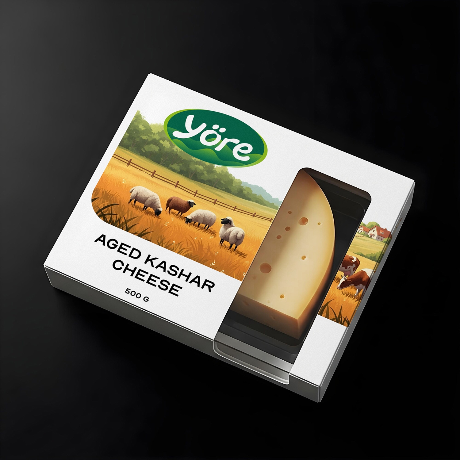
For everyday products like kashar, cheddar and white cheese, we designed a label system centered on the farm illustration and the brand emblem. The system works with the same logic on both vacuum packs and boxes. The aged kashar box and the mozzarella balls packaging, despite their different forms, read as members of the same family.
Here, the illustration acts as a second common denominator. The logo tells you the brand's name; the farm illustration tells you where the brand comes from. The product's name and type find their own place on top of these two layers on every package. Shoppers recognize the brand first, then the product, and that order is deliberate.
Not overdoing differentiation in everyday products is a decision too. These products sit side by side on the same shelf and are bought often. What they needed wasn't an order shoppers would have to relearn on every trip, but one they learn once and then always find in the same place.
Setting apart a premium line doesn't mean splitting the brand
At the other end of the family is the gift range. For butter and specialty Anatolian cheeses, we designed a premium line with an embossed logo and a gold finish: classic butter in gold packaging, a butter box shaped like a diamond-cut slice of baklava, and tins for Roquefort and specialty Anatolian cheeses. These products look distinctly different from the everyday packs. They need to, because they're bought for a different occasion.
The critical question was how far the premium line could move away from the everyday products. Our answer was that the material and finish could change, but the fixed layer could not. The gold finish and embossing don't redraw the logo; they carry the same logo in a different texture. That lets the brand appear on both everyday and premium shelves with the same identity.
Building the premium line as a separate sub-brand looks easier in the short term. In the long term, you end up having to grow two separate brands side by side. A premium line that stays within one identity carries the everyday product's recognition over to the gift box, and the gift box's sense of care over to the everyday product.
A gift box often ends up in the hands of someone who has never come across the brand. That person gets to know the brand for the first time through the box. If the logo on the box is the same as the one they'll later see on the supermarket shelf, that familiarity carries over to the shelf.
Three rules that hold a product family together
We can boil the system we built for Yöre down to three rules:
- Keep the fixed layer small. The fewer shared elements repeat across every product, the more strongly those elements read. At Yöre, this layer consists of nothing more than the logotype and the hill silhouette.
- Differentiate in the product information, not in the brand. The product's name, type and packaging format can change; the character of the logotype and the hill silhouette doesn't.
- When the line changes, let the finish change. The move from everyday to premium is signaled not by a new logo but by a new material: gold finish, embossing, tin.
What these rules have in common is that they rest on the system, not on individual design decisions. No matter who prepares the packaging or what format it's printed in, as long as the fixed layer stays in place, the family holds together. That's also why we kept the rules to three: a rule that isn't remembered is a rule that isn't applied.
What we learned
The project took ten weeks and covered both brand identity and packaging design. Handling identity and packaging in the same process let us think about the fixed layer alongside the packaging formats from day one.
If a product family falls apart as new products are added, the problem isn't the new product; it's the rules that were never written down for the first ones. Yöre now appears with the same identity everywhere, from its everyday products on the supermarket shelf to its gift tins. What made that possible wasn't making each package beautiful on its own, but deciding up front which elements would never change.