We built a brand identity for Bak.Pay carrying the promise of "Payment Made Simple."
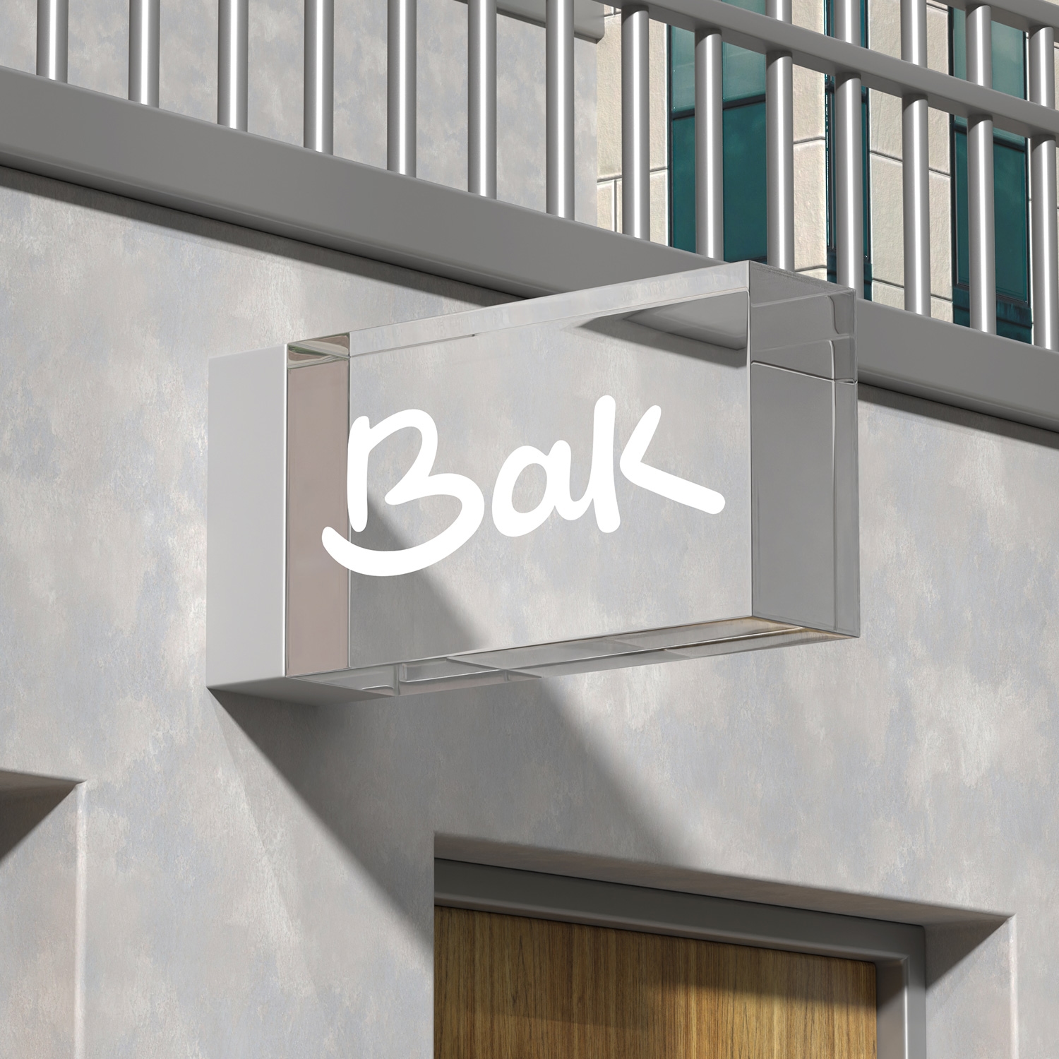
With an identity system centered on the handwritten "Bak" signature, using red-black contrast to convey trust and simplicity, we gave the brand one voice in every medium, from business cards to billboards.
Client

Problem
Bak.Pay's brand presence was fragmented across advertising and corporate materials; the sense of trust and simplicity a payment brand needs wasn't backed by a clear visual system.
Stratejimiz
We built an identity system centered on the handwritten "Bak" signature and red-black contrast — the same simple, trustworthy brand voice carried through every application, from business cards to billboards.
Solution — Corporate Stationery
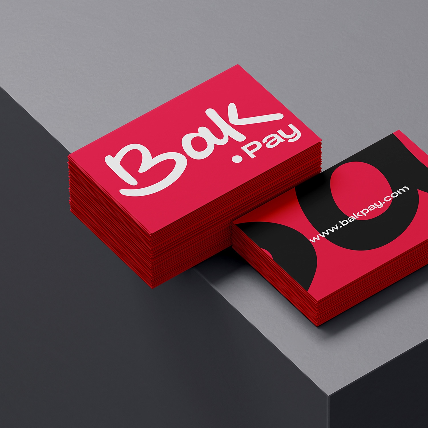
Business cards and branded merchandise.
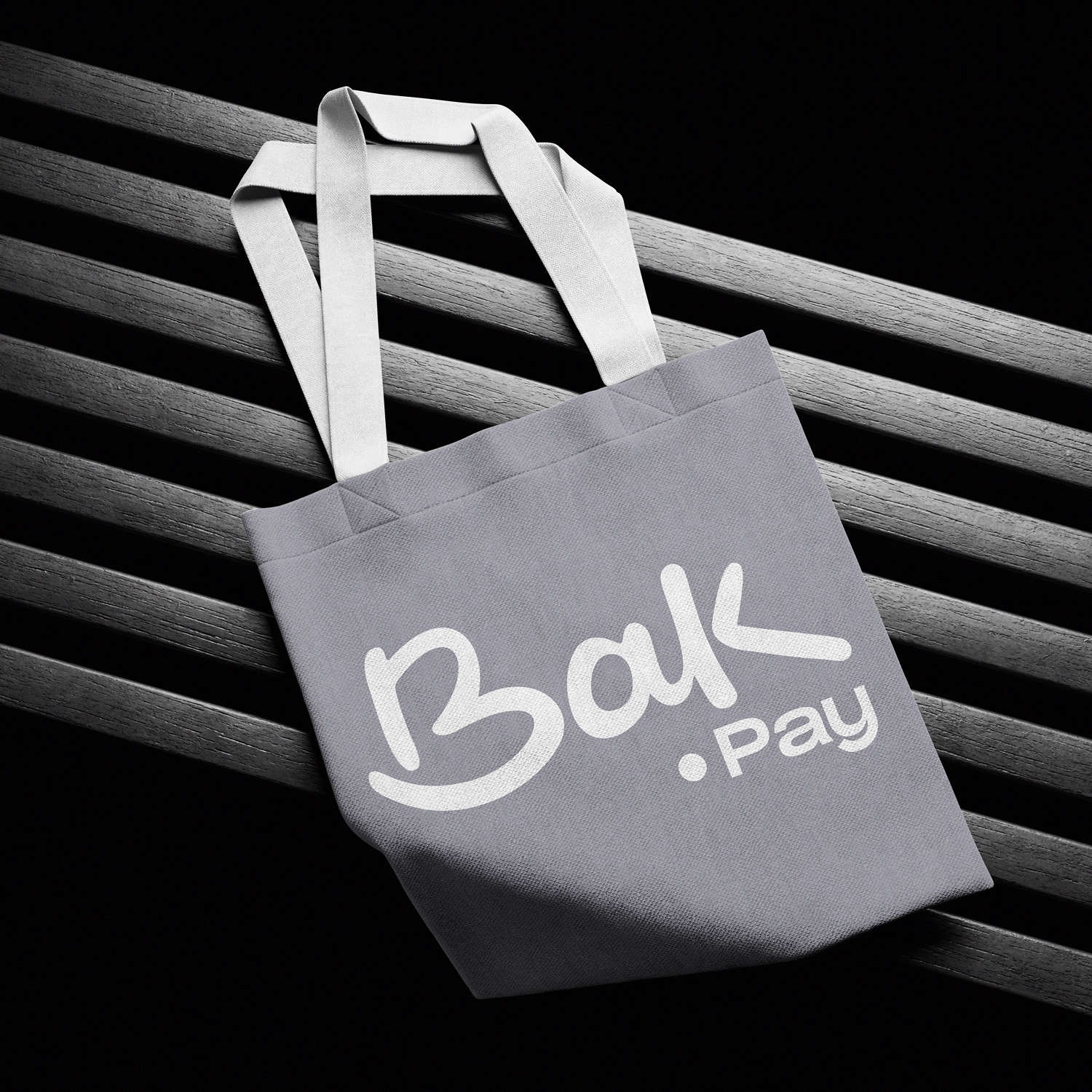
We designed business cards and corporate merchandise such as tote bags built on the red-black contrast; every material reinforced the brand through the handwritten signature and the "B" emblem.




Solution — Ad Campaign
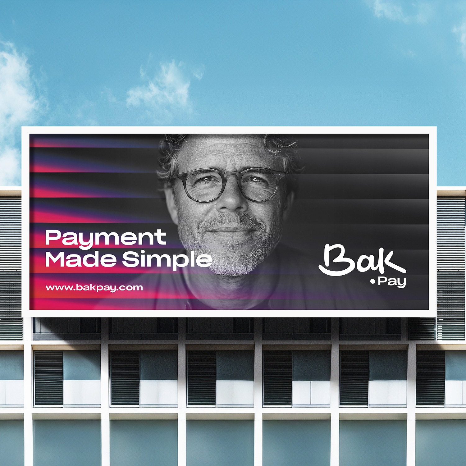
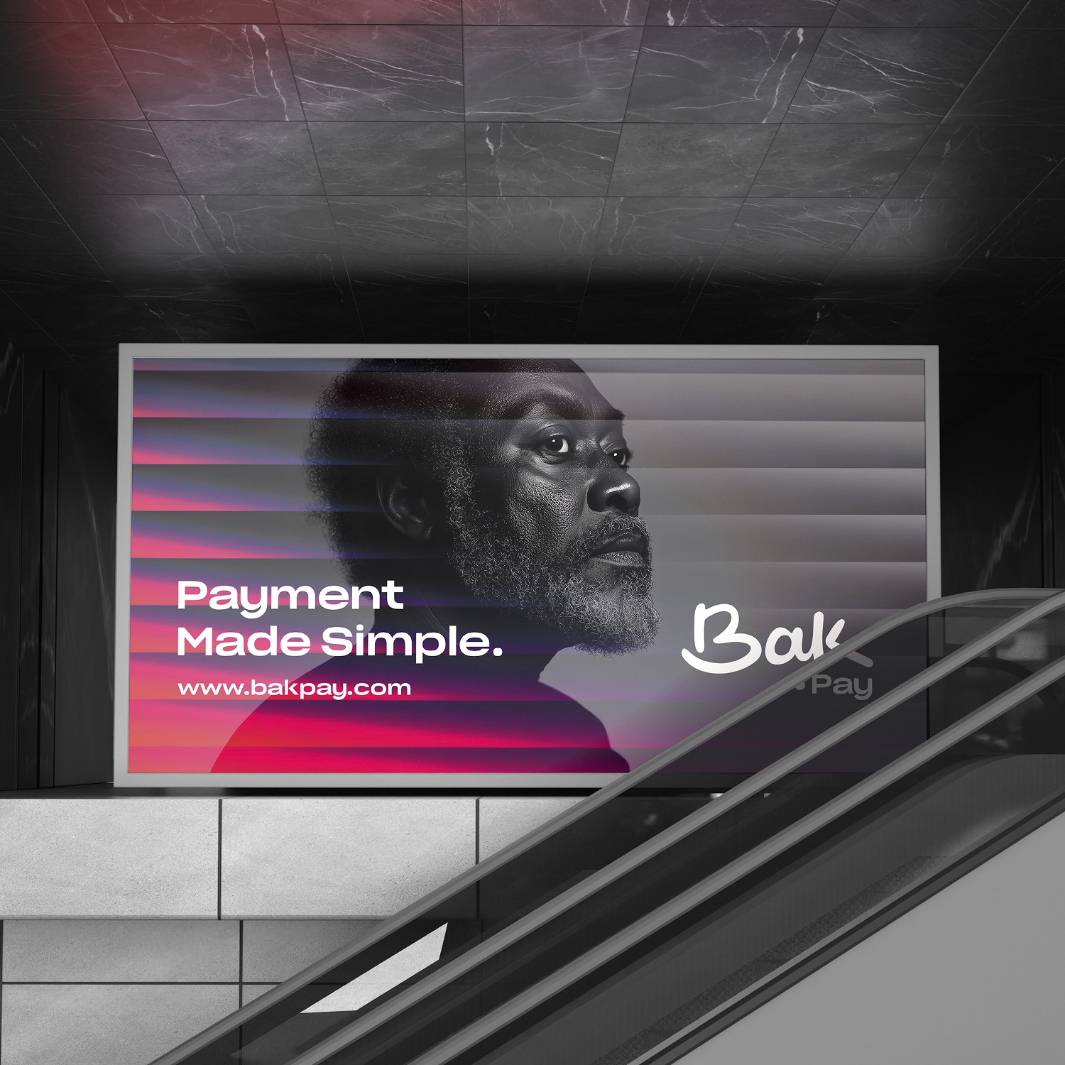
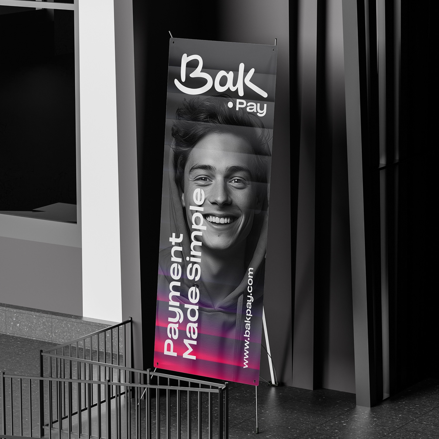
Out-of-home ads carrying the "Payment Made Simple" message.
From metro stations to standing banners, we carried the "Payment Made Simple" campaign across the city with consistent portrait photography and brand messaging.
Result
A payment brand recognized everywhere in the city.
Bak.Pay now shows up with the same trustworthy brand language at every touchpoint, from billboards to business cards and from merchandise to campaign visuals.