We built a trust-inspiring corporate identity system for xGuard.
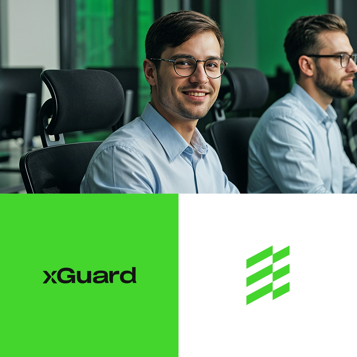
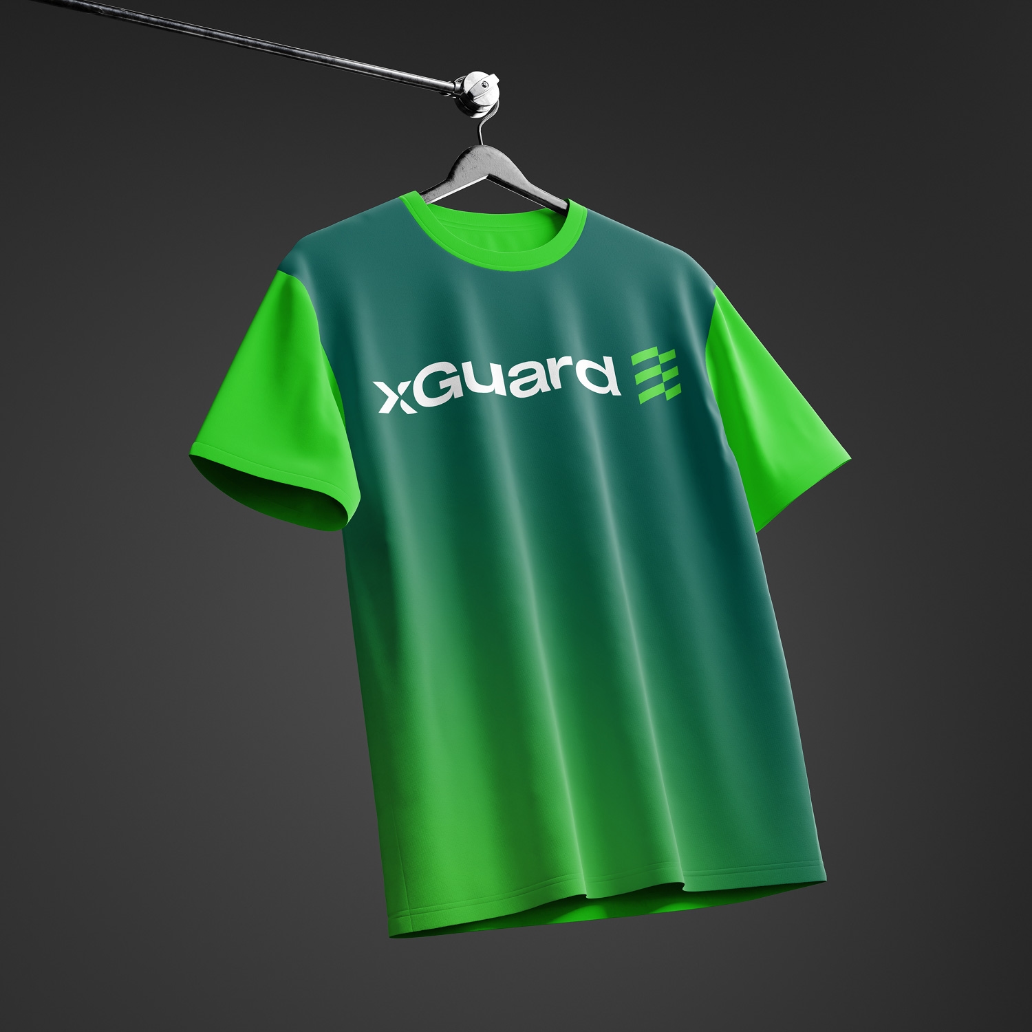
With an identity system that balances dark green and neon green and centers on the bar emblem, we gave every xGuard touchpoint, from business cards to office signage, a single brand language.
Client
Problem
xGuard's brand presence gave an inconsistent impression across corporate materials due to scattered color and logo usage.
Stratejimiz
We built an identity system based on dark green and neon green, centered on the bar emblem — the same brand language carried through every application, from business cards to signage.
Solution — Corporate Stationery
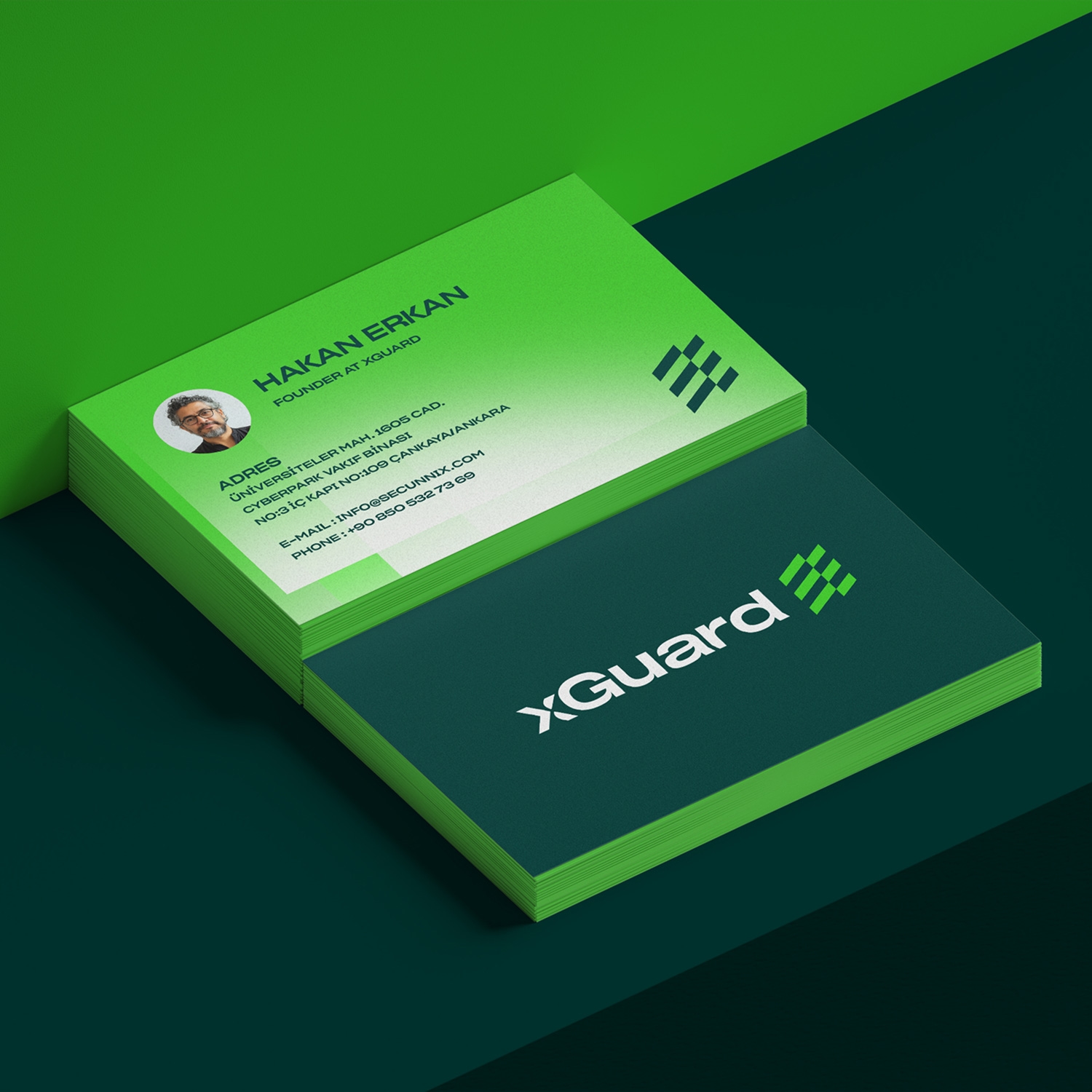
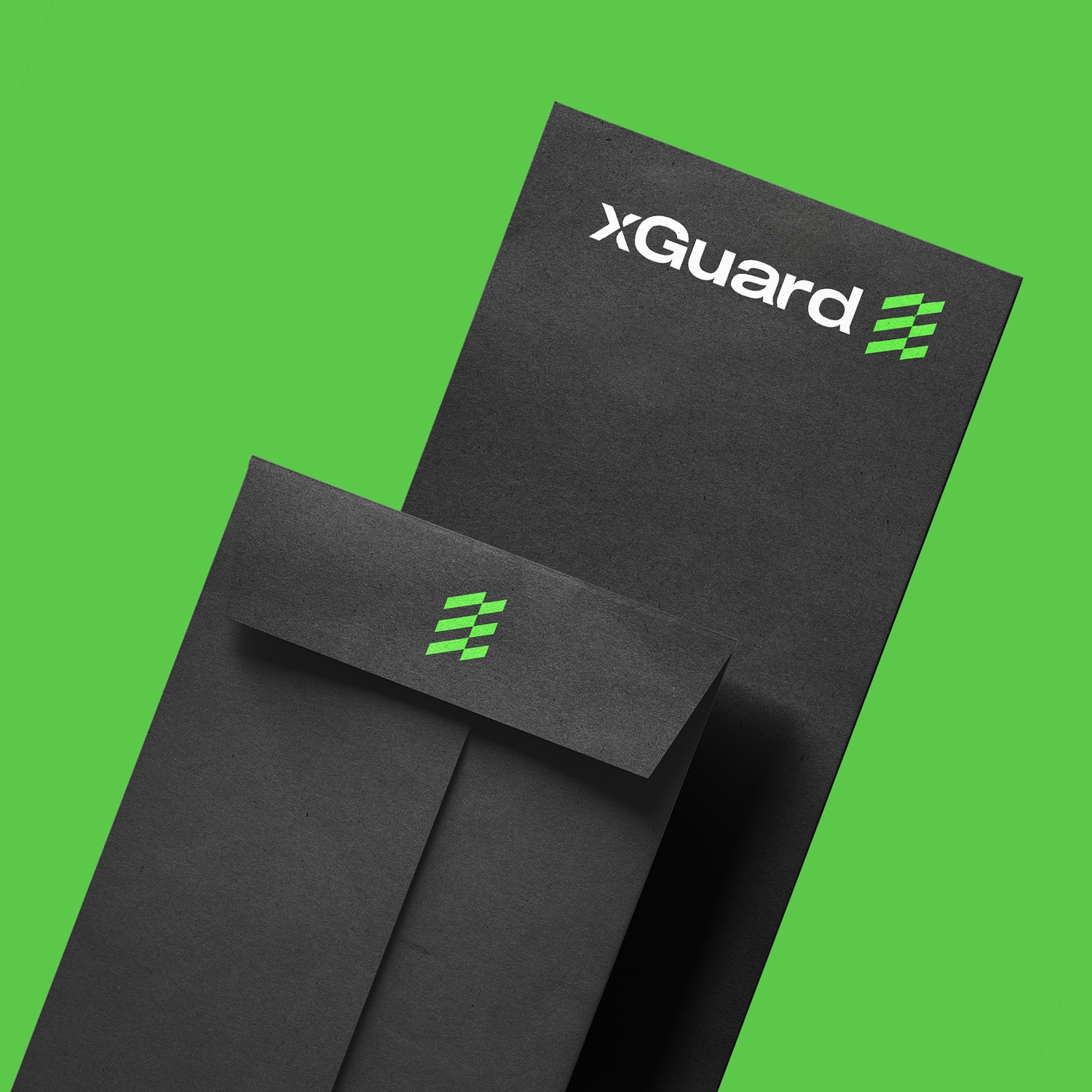
Business card, letterhead, and envelope system.
We designed a consistent corporate stationery set that moves from gradient green to dark backgrounds; every material reinforced the brand with the same emblem and typography.
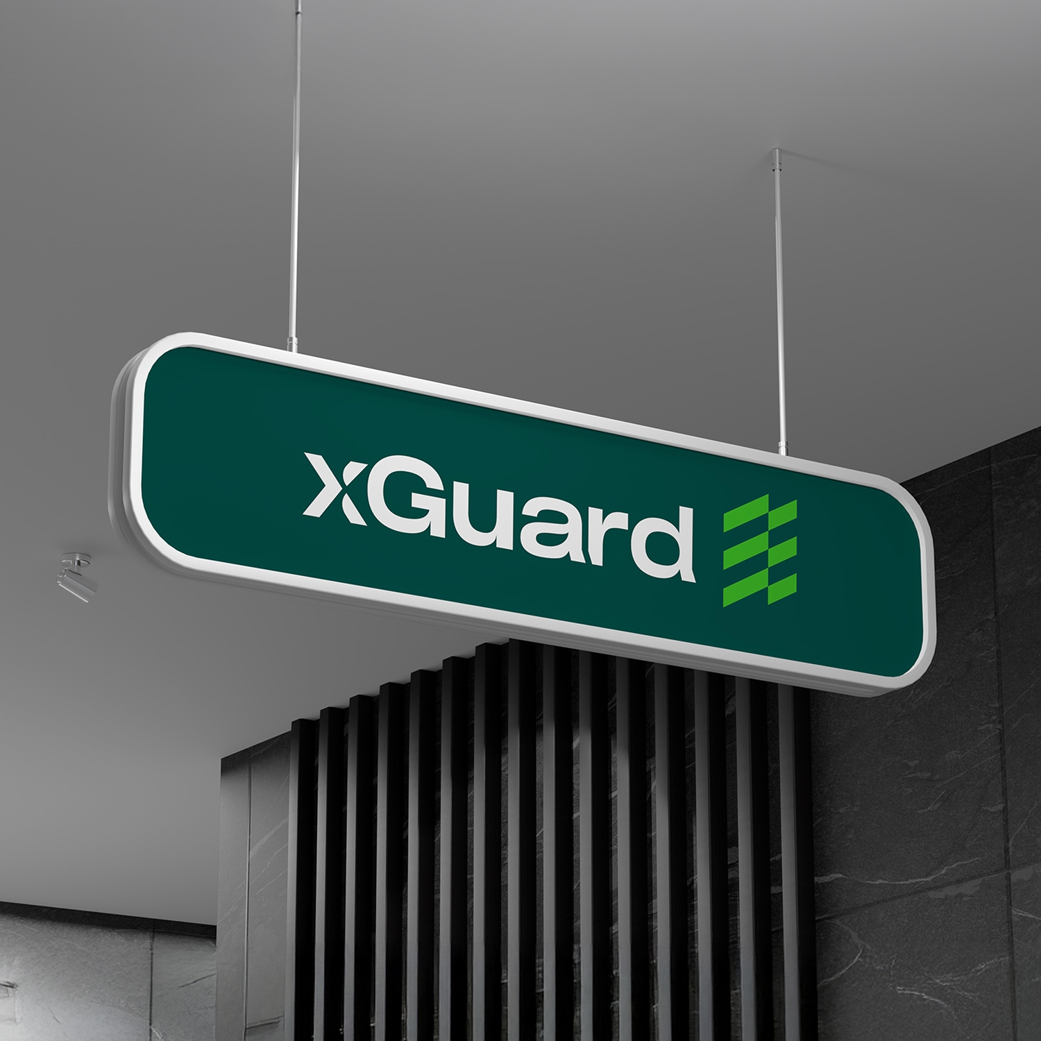
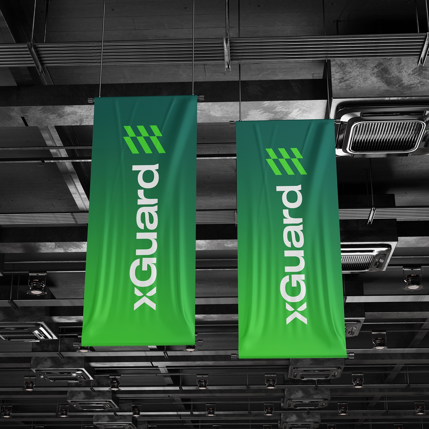
Solution — Spaces and Signage
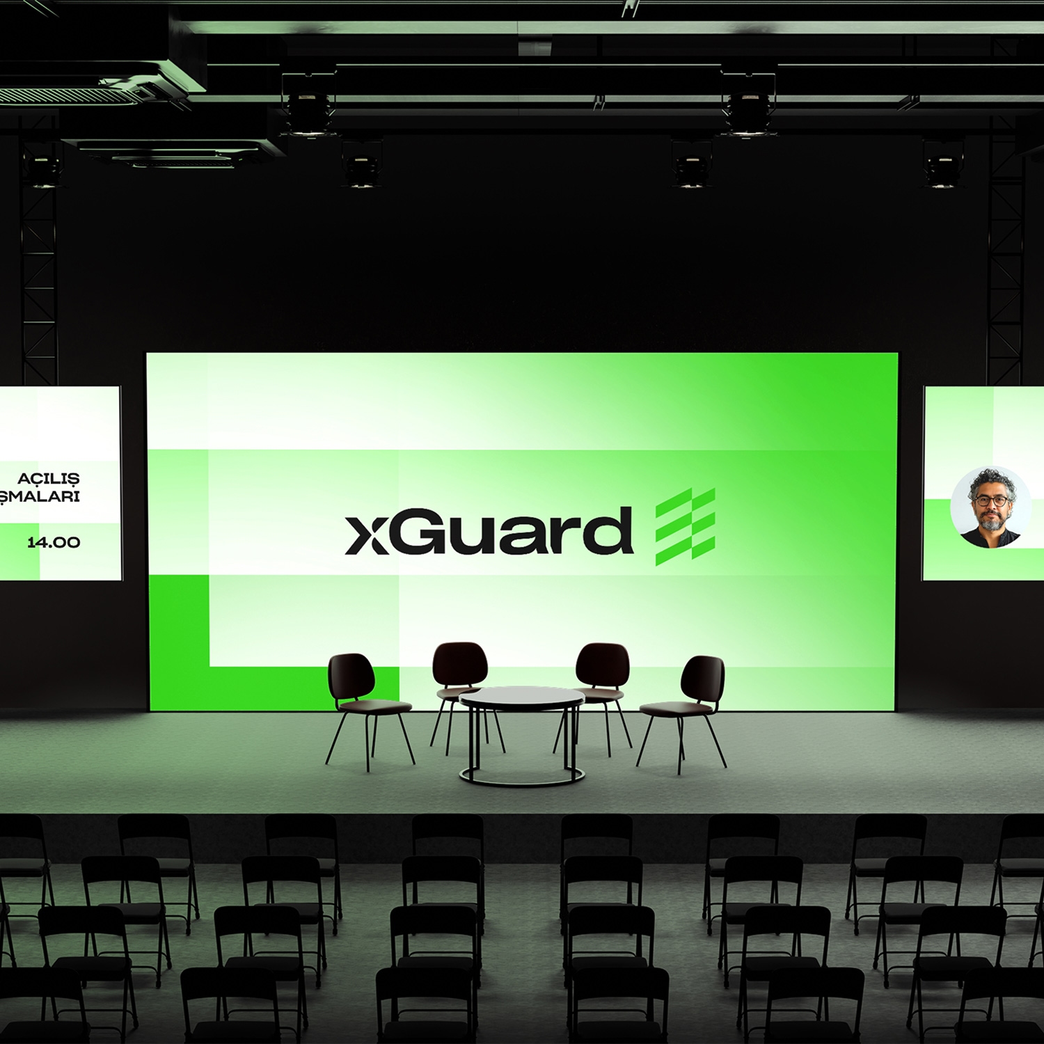
Consistent brand presence across office and event spaces.
From office signage to event flags, the brand emblem and color system appeared with the same consistency in every spatial application.
Result
One brand at every touchpoint.
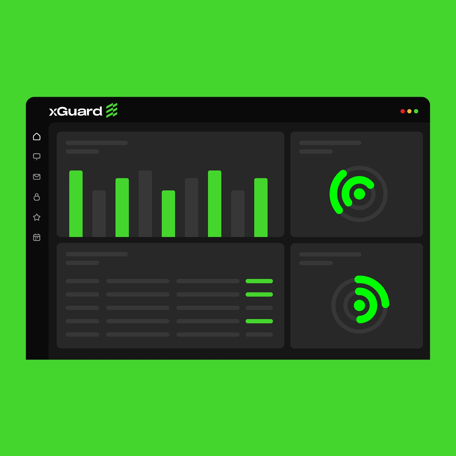
From business cards to office signage and from event stages to digital panels, xGuard now presents the same trustworthy brand language at every touchpoint.