A brand identity for Practicore that tells how healing spreads.
For the clinic management system Practicore, we built the entire identity system, from its name and symbol to its typography, brand guidelines, and applications.
Client


Problem
Clinic software tends to speak the same blue, sterile visual language; there is no character that makes the brand memorable.
Stratejimiz
We built everything around the way healing spreads: a dandelion symbol made of rays, a deep green palette, and a serif wordmark.


Solution — Brand Guidelines
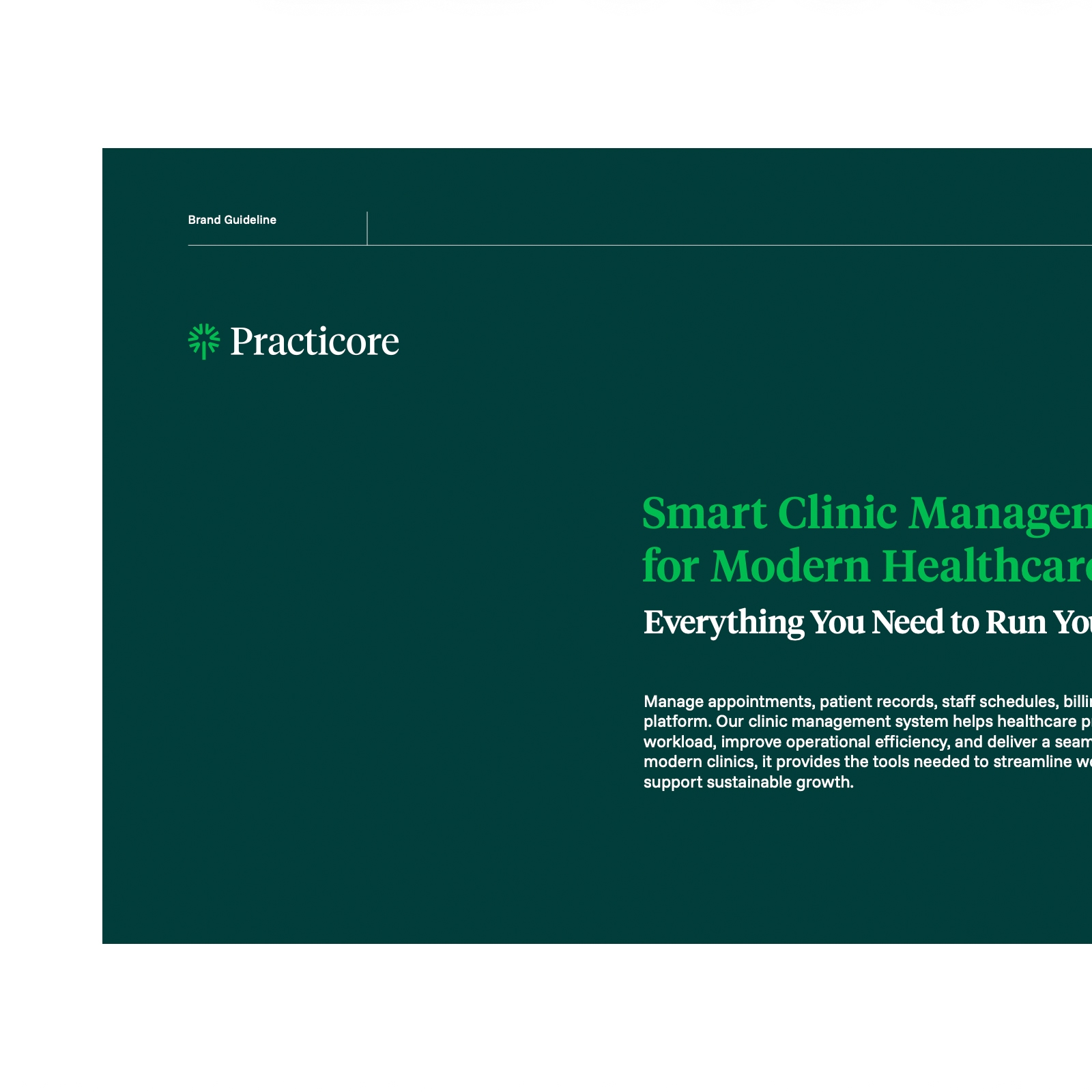
One guideline, from the symbol's geometry to the communication language.
We brought construction, clear space, color, and typography rules together in a single brand guideline, along with the photography language and communication examples.


Solution — Photography and Print
A brand language with the same warmth, from portraits to business cards.
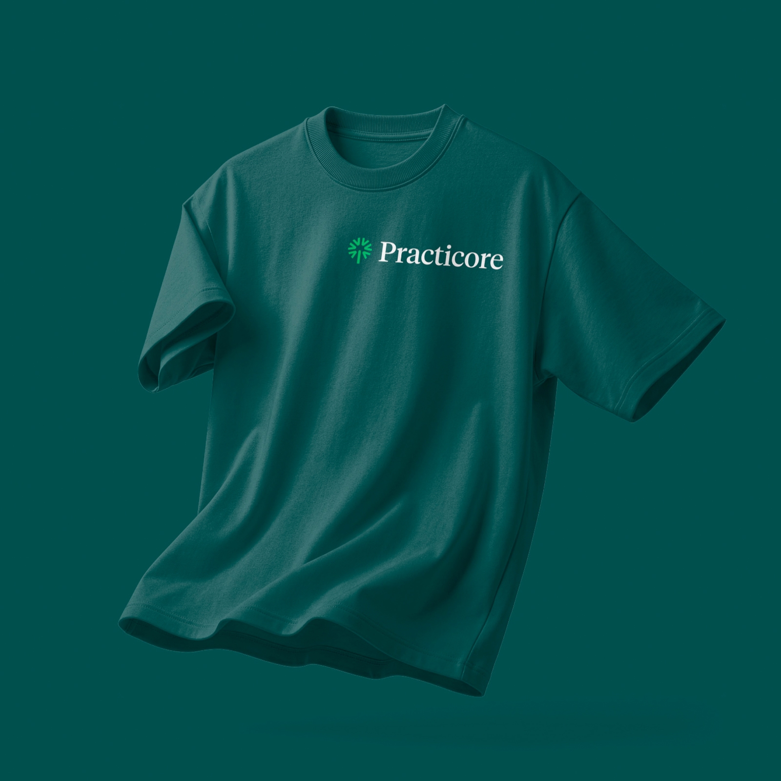
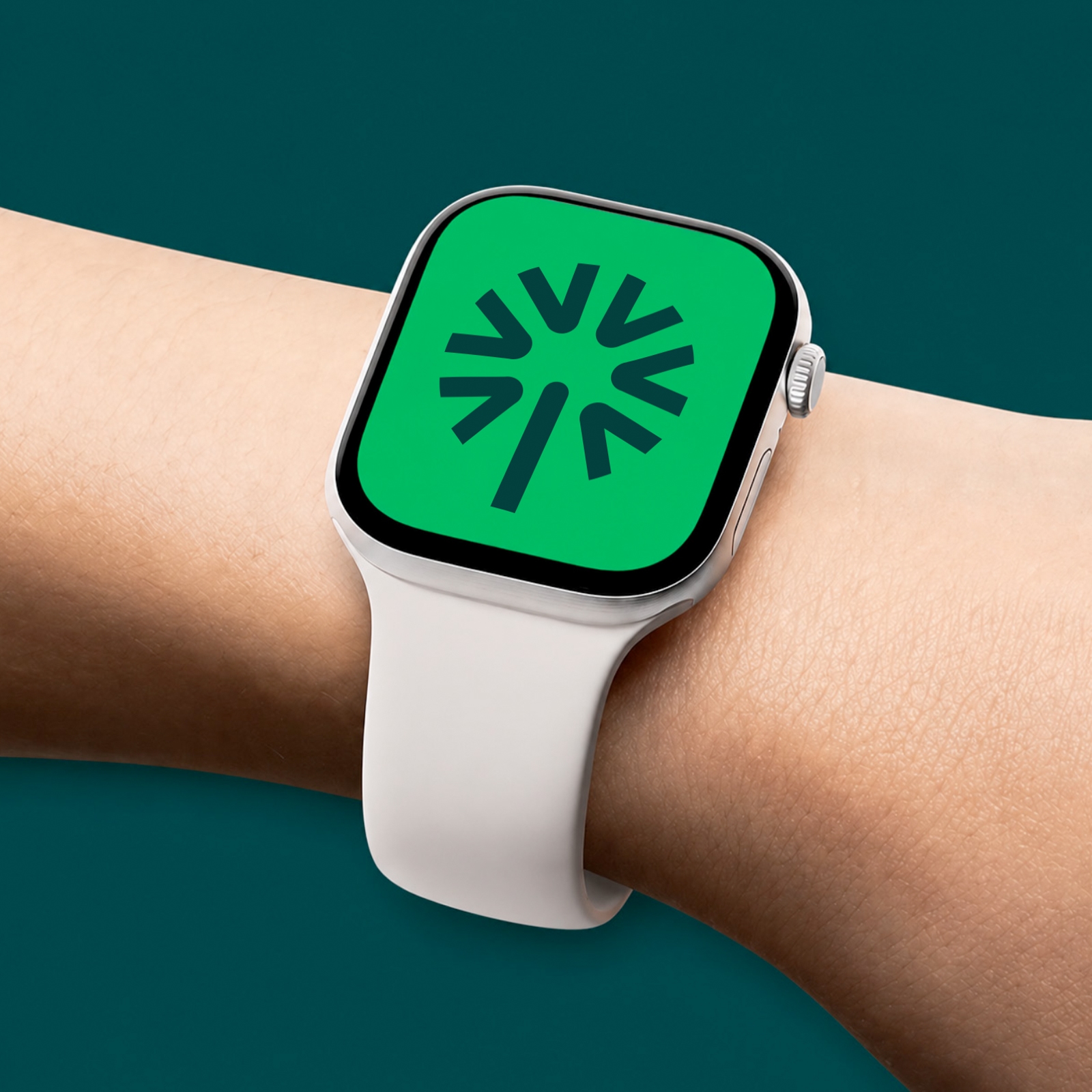
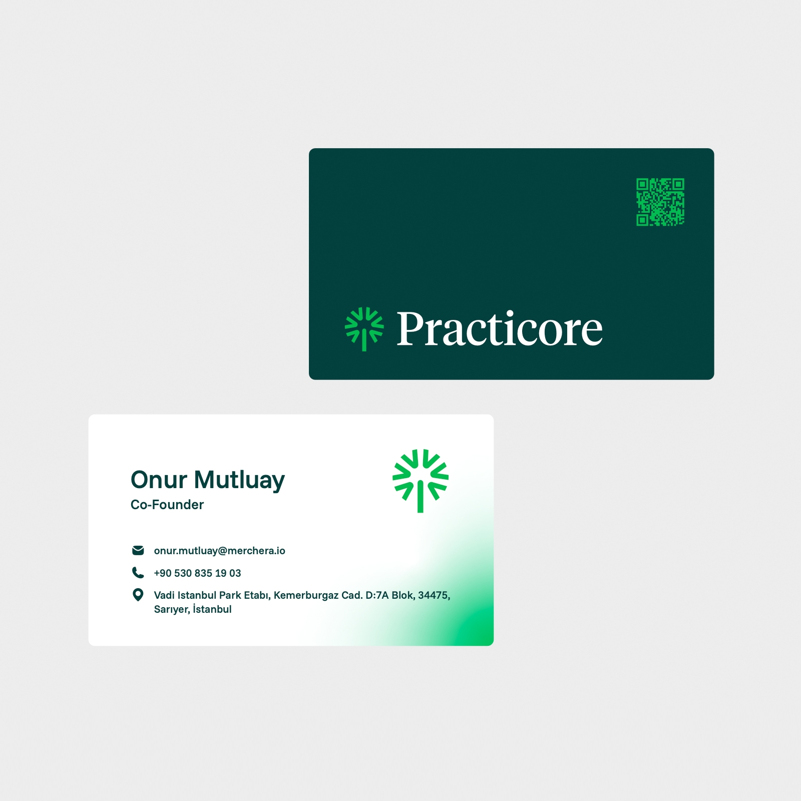
We carried the identity beyond the screen with a portrait language on deep green backdrops and gradient-supported print materials; the symbol works on its own on every carrier.

Result
A warm, trustworthy identity that stands apart from its sector.
Practicore now stands apart from the sterile language of its software category, carrying the same character across every medium with its deep green palette and dandelion symbol.