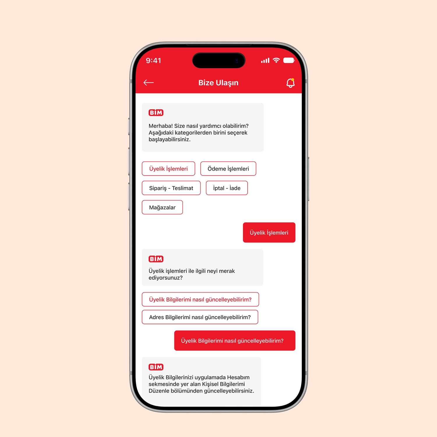
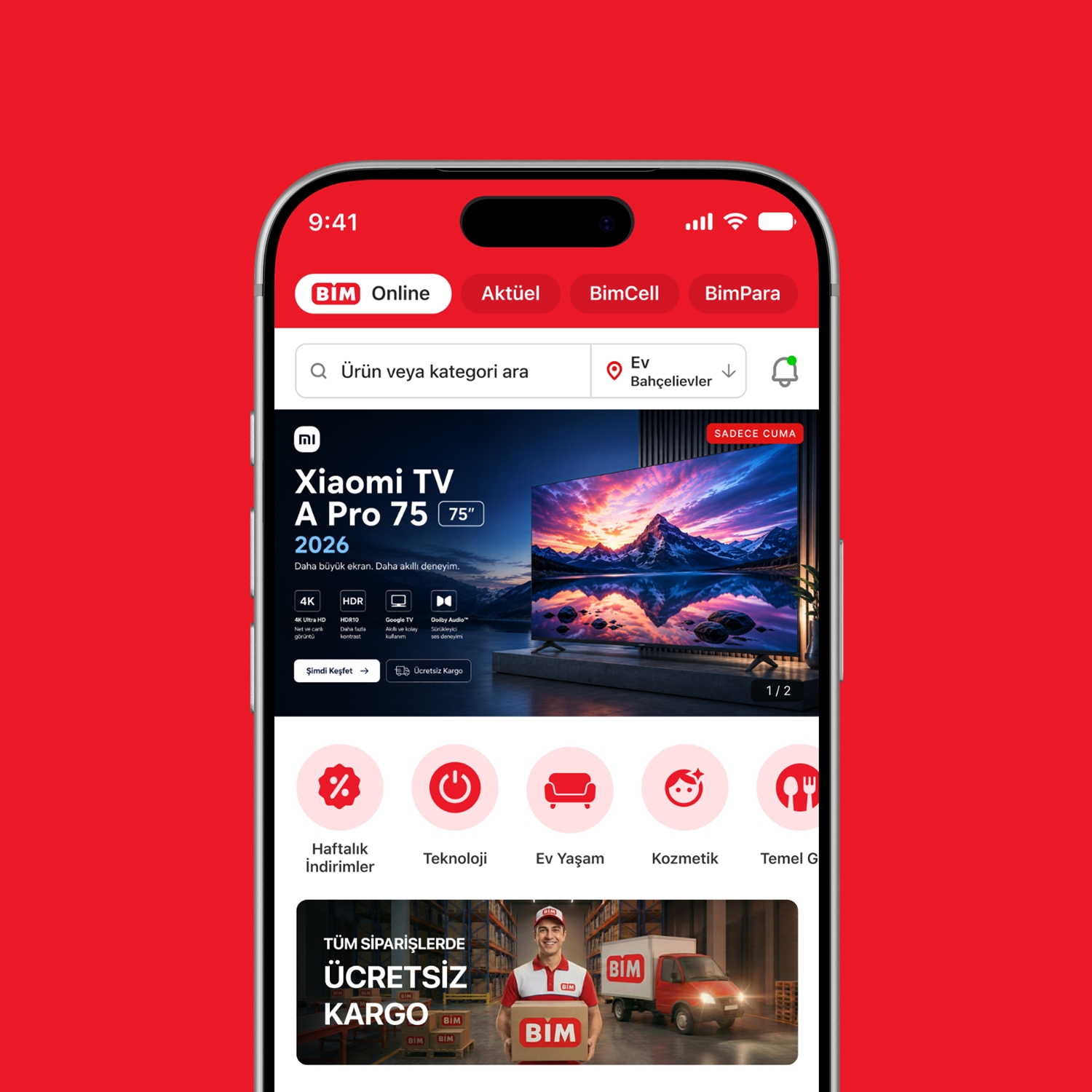
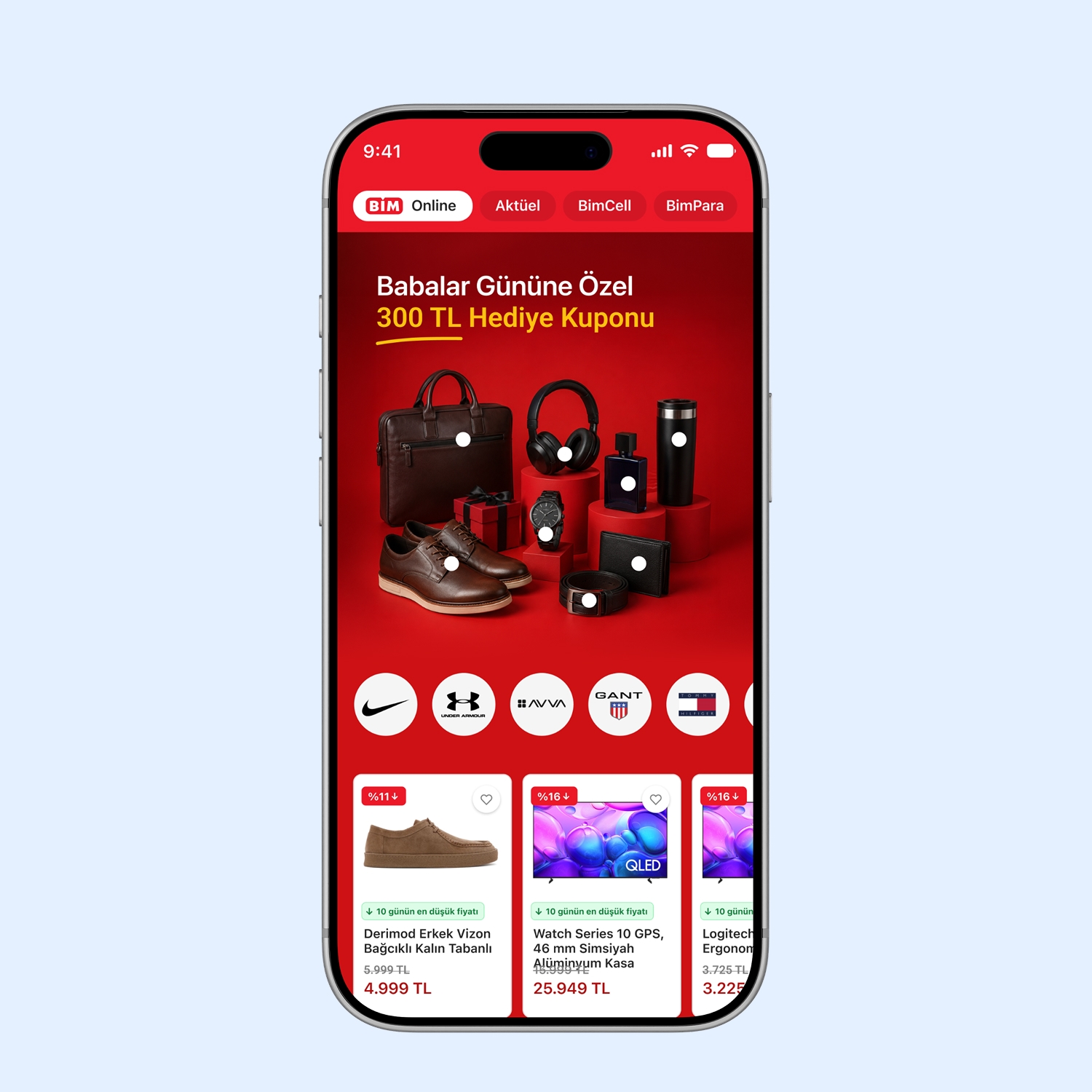
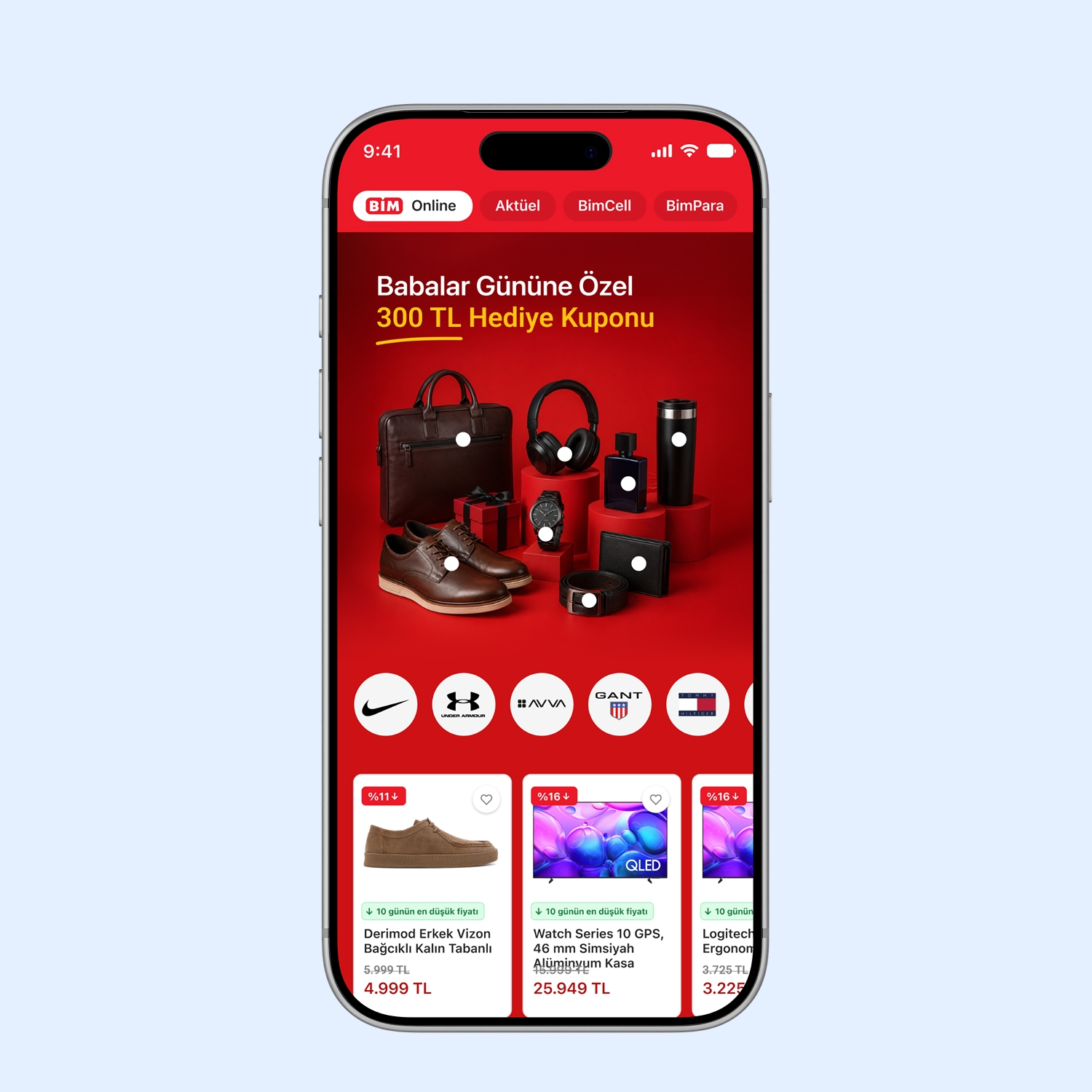
We designed a more modern, user-experience-focused mobile interface for BİM Online.
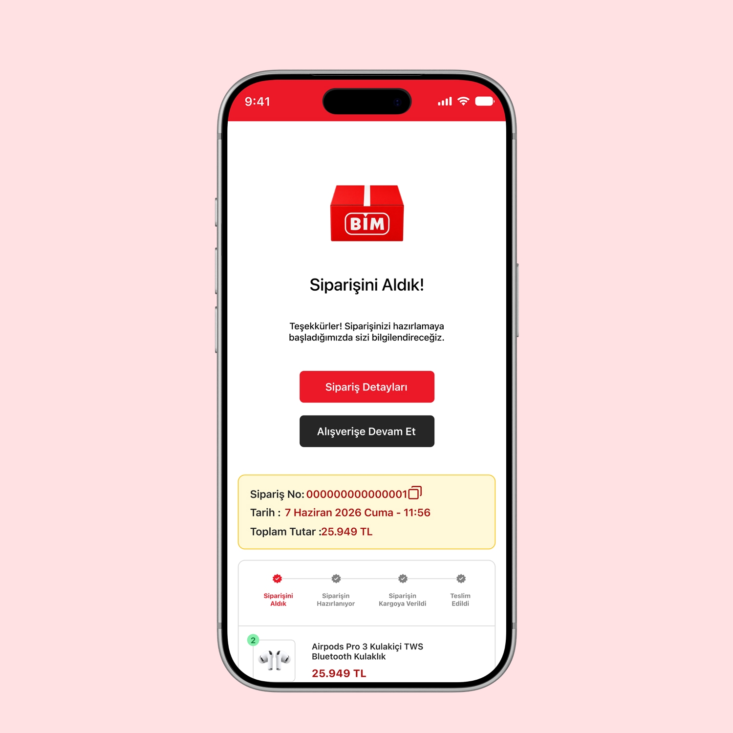
We redesigned the entire flow, from product discovery to checkout and from the empty cart to error screens.


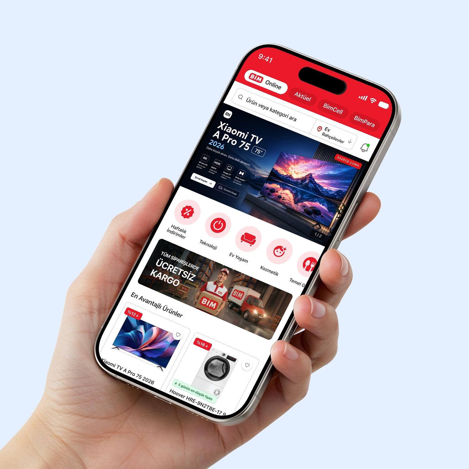
BİM's existing app had fallen behind current e-commerce standards in user experience: a cluttered home screen, an inconsistent filtering flow, and generic error/empty states kept wearing users down.
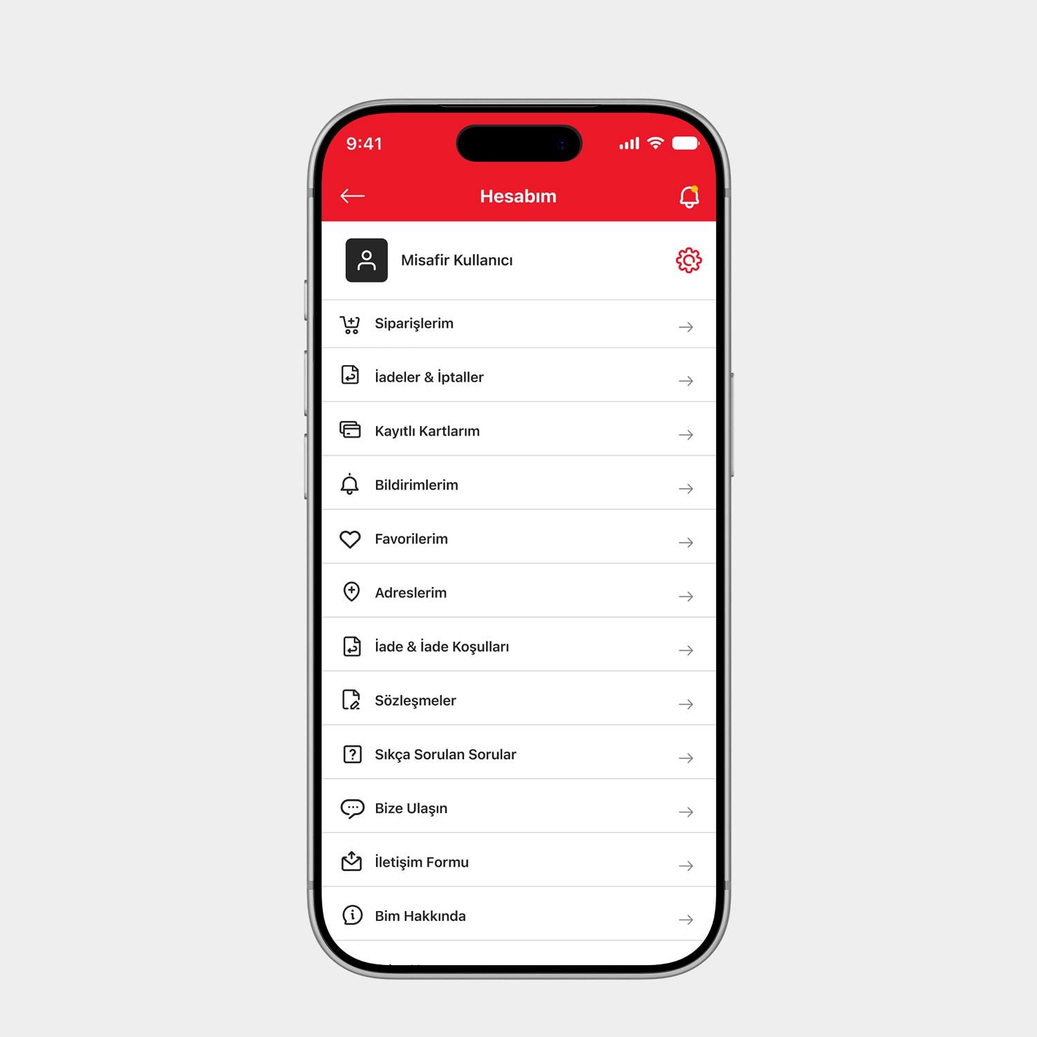
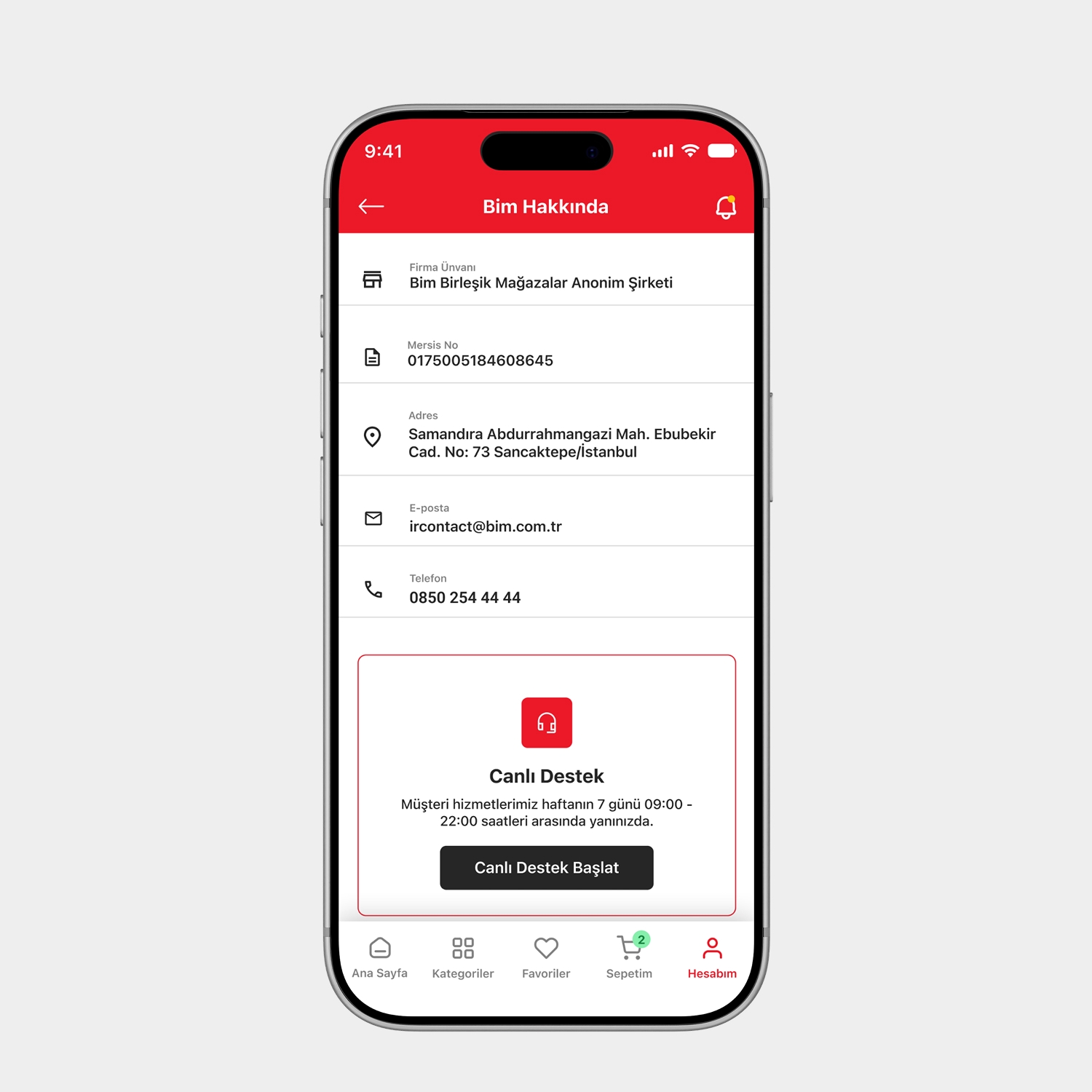
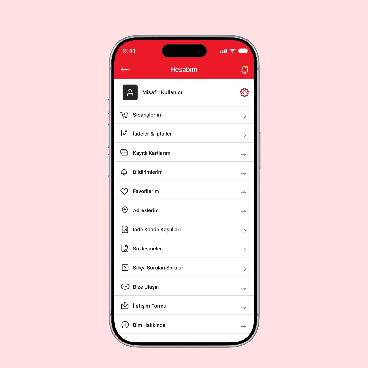
We rebuilt product discovery, checkout, and system states (empty cart, connection error, maintenance mode) with one consistent design language — bringing the interface up to today's mobile shopping standard.
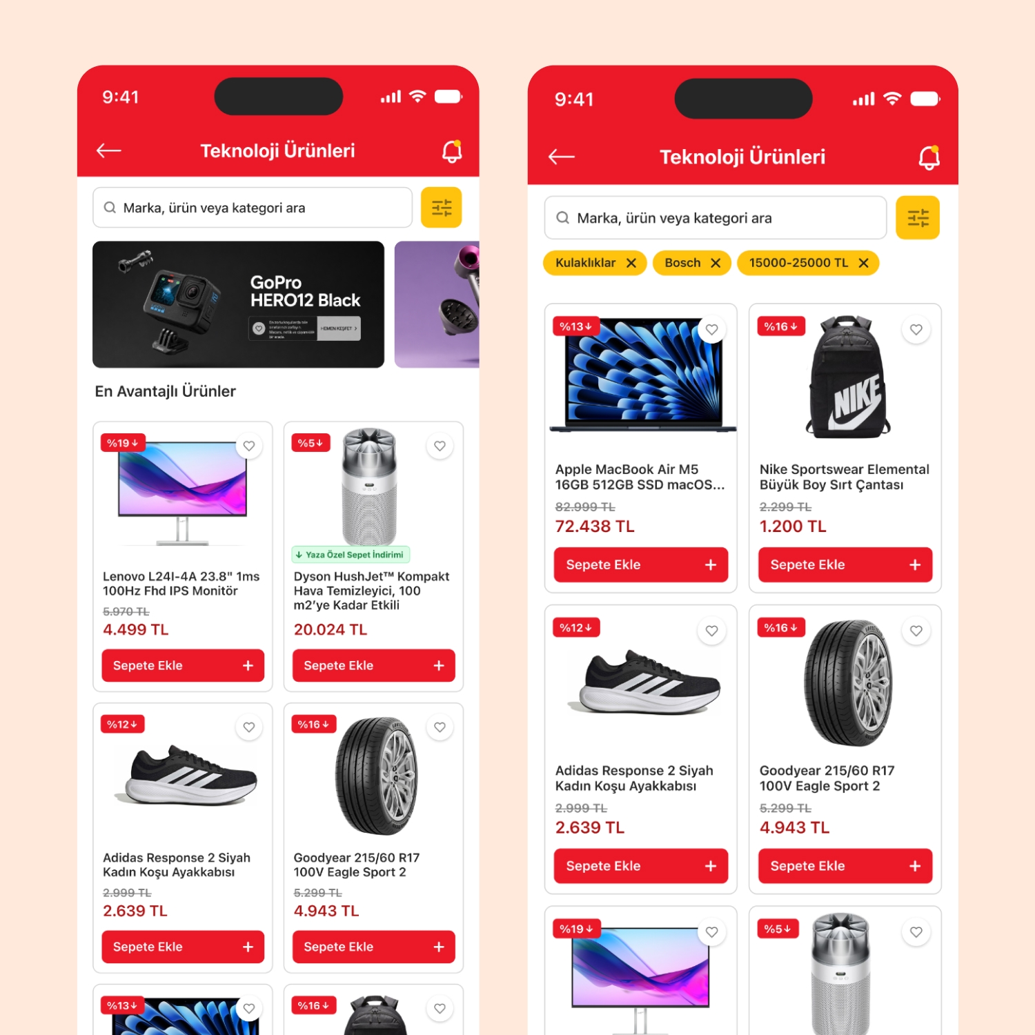
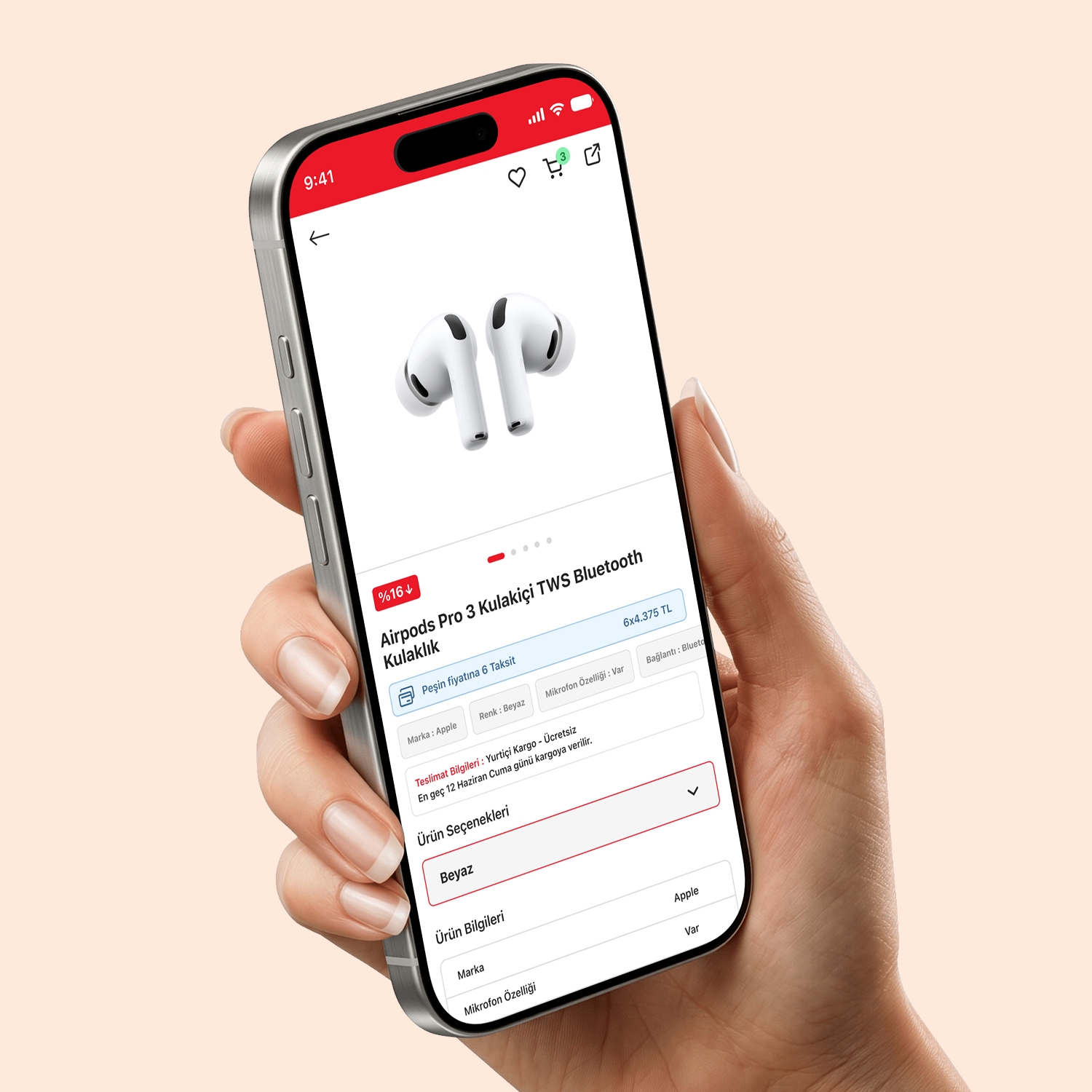
A smooth journey from filtering to product detail.
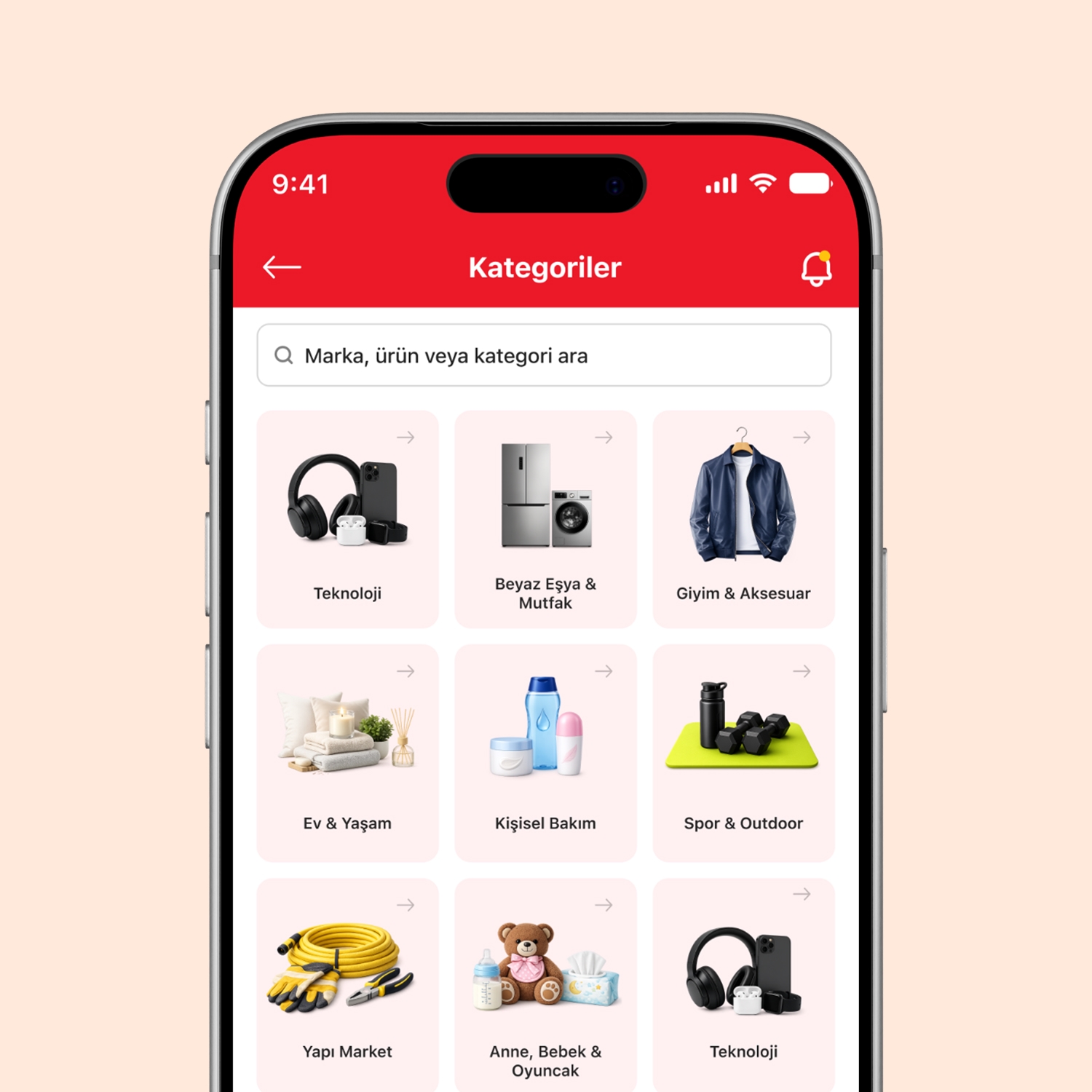
We brought category and filter tags together under a single search bar, and surfaced installment and delivery information on the first screen of the product detail page.
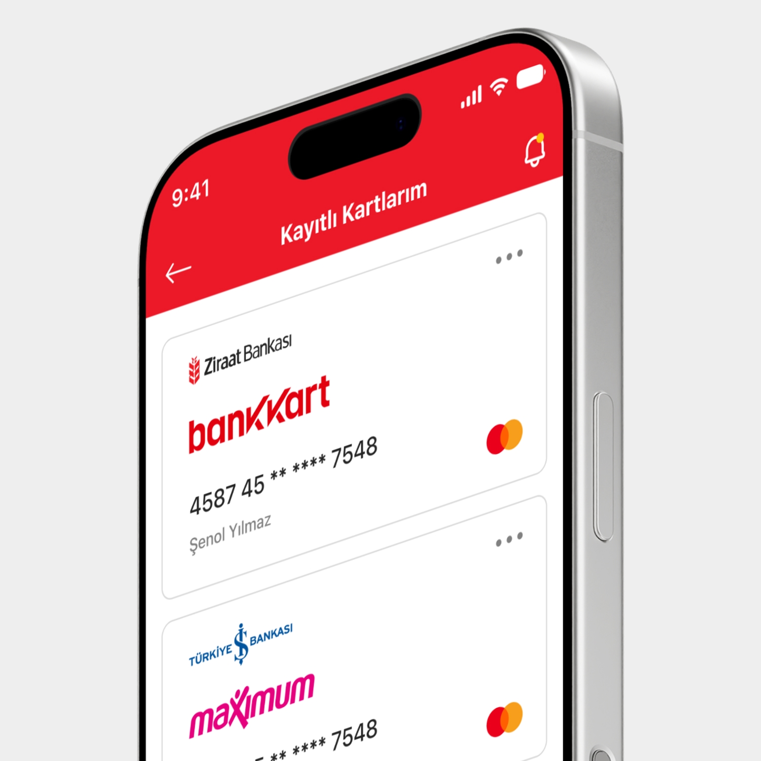
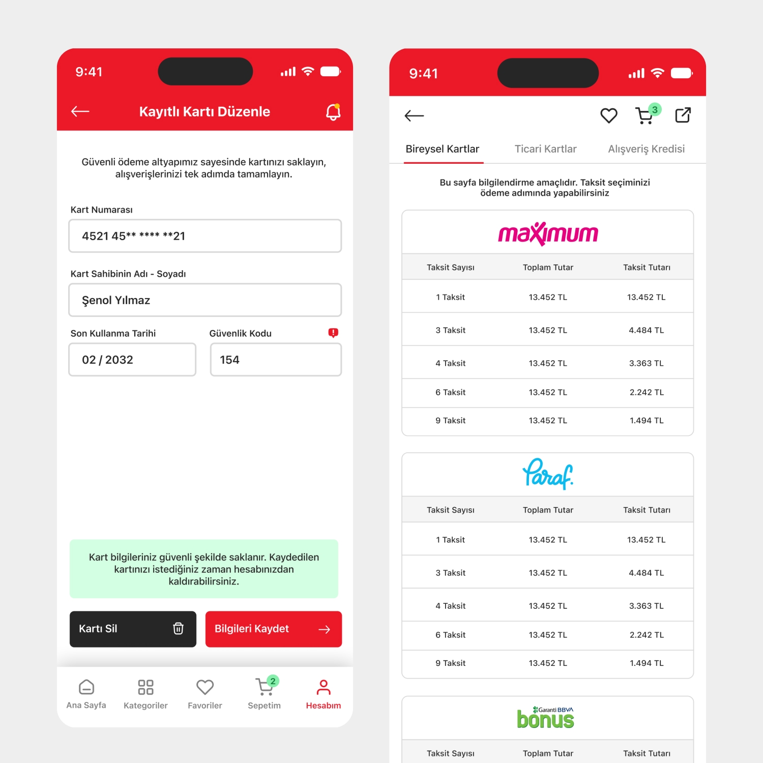
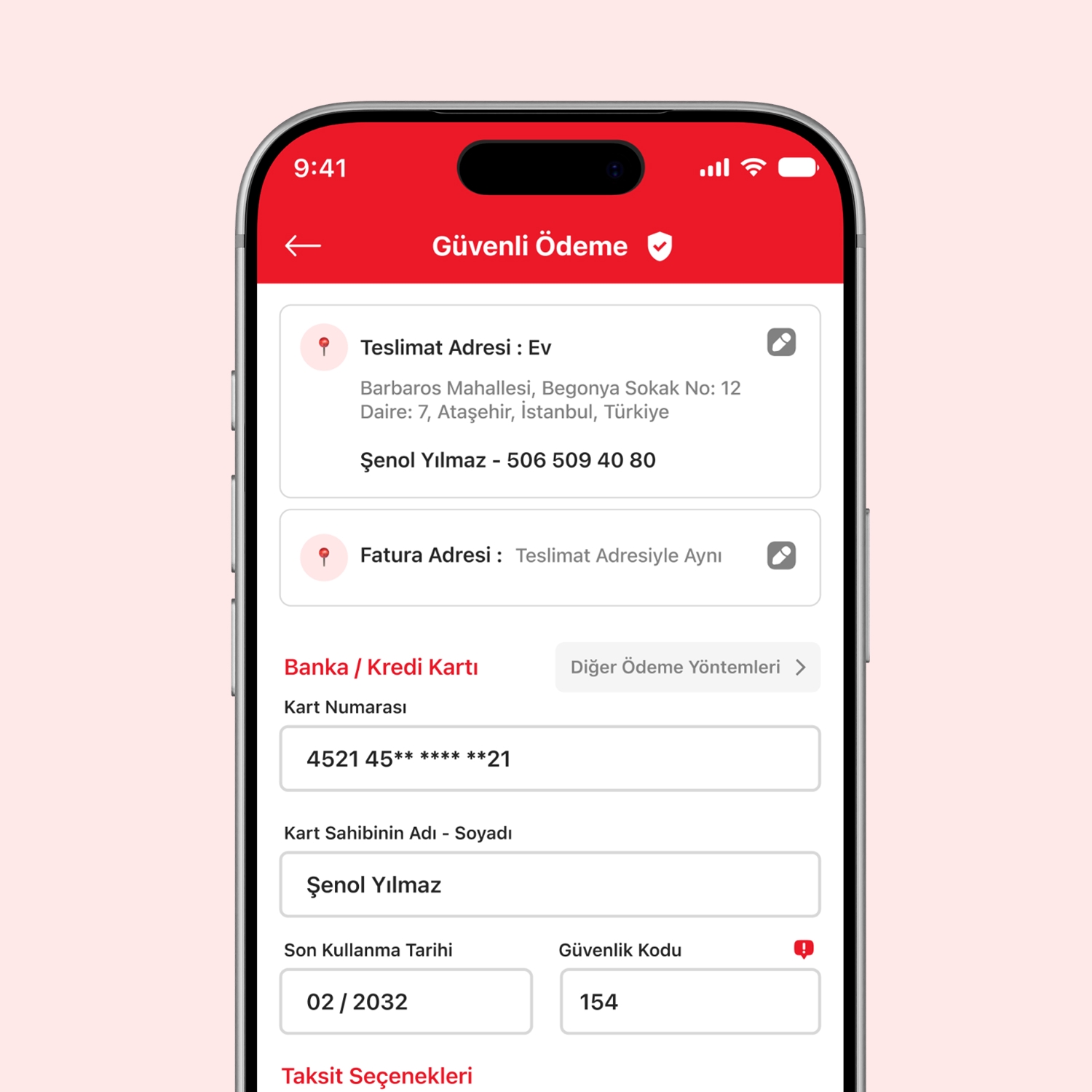
A clear checkout flow, from saved cards to installment tables.
We split saved-card editing and installment comparison into separate screens, and brought address and card details together on a single page in the secure checkout step.
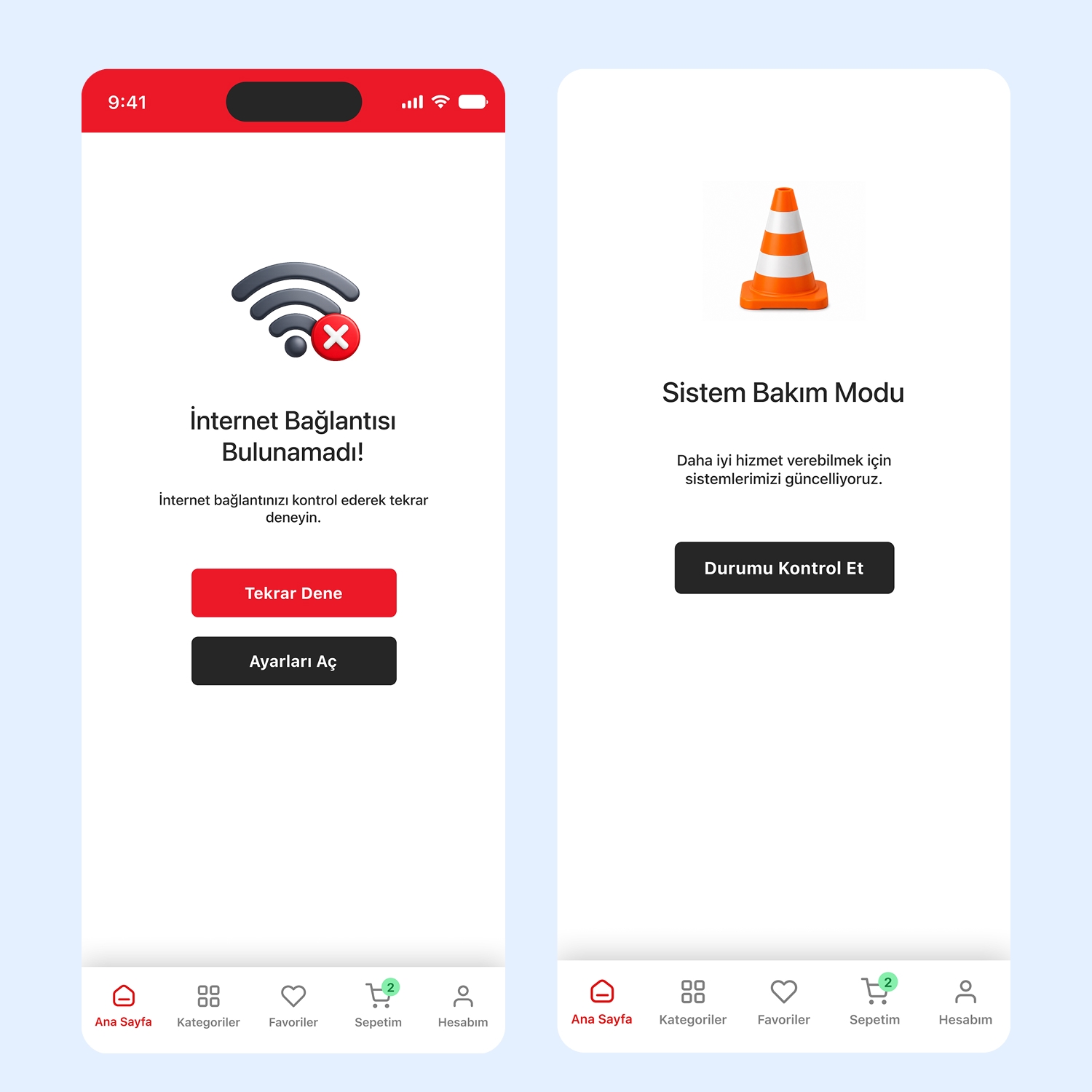
Screens that speak in the brand's own voice instead of generic alerts.
We redesigned system states like connection errors, maintenance mode, and the empty cart with BİM's own visual language and tone instead of default icons.
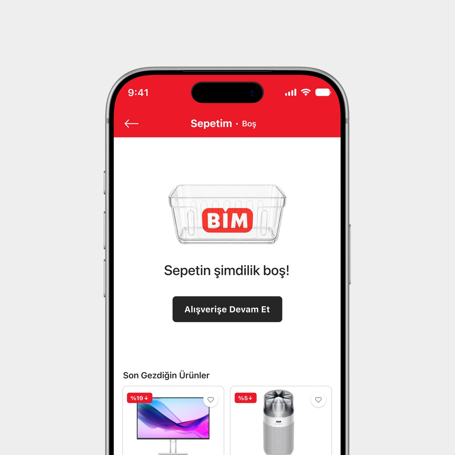
A modern, consistent, and familiar shopping experience.
Redesigned end to end from discovery to checkout, the interface brought BİM Online up to the standard users expect from their everyday shopping apps.
On this project, we focused on interface (UI) and user experience (UX) design.